...how last night's quadruple overtime game would have ended had it been played in Denver instead of Portland.
It's pretty common knowledge that home-court advantage is very present in the mile-high city (something I had looked into a few years ago on this very blog), so seeing how tired even some of the Nuggets players, I really wonder what a full hour of play in high altitude would have done to the Blazers team.
And because this is primarily a stats-oriented blog, we should definitely point out the reporting issue due to the NBA not being used to players logging over 59 minutes and 59 seconds of play:
Quite an impressive stats line for a single minute of play!
Every year like clockwork, the NBA playoffs are upon us, historically one of my favorite topics to post about!
As I was comparing my predictions with what has taken place on the courts these past few weeks, I realized two things.
First: had the Spurs won that Game 7 against the Nuggets, I would have had all first round predictions correct.
That in itself isn't really jaw dropping, there are only 8 match-ups in the first round, and mostly of them are highly predictable. NCAA March Madness in comparison has 32 first round match-ups.
It wasn't jaw-dropping for another reason. (Let me give you a hint: my young kid who knows nothing about the NBA got all predictions for the first round correct)
That's right, simply by predicting the higher seed would win the match-up was sufficient to get the entire first round perfectly! Not a single upset so far! We sports-lovers have been derived of that special moment when the young challenger topples the giant. Ah Spurs, you were so close!
And here is where things get interesting: the last time there weren't any upsets in the NBA playoffs was... in 1974!!! The second year the NBA was created.
Now granted we're only halfway through the playoffs and upsets can still happen. But restricting to first round only, the last year we had no upsets was in 2008, over 10 years ago. Historically, upset rate is just above 25%, so we should already have expected about 2 so far in the first round!
We can also notice incredibly high rates in the 70s and early 80s, that's essentially due to the fact that Playoffs were considerably shorter then (less teams so no first rounds, and certain rounds were best-of-3 providing a much better opportunity for challengers).
While we're on the topic, here are some other stats on upsets.
Upsets seem to be more common in the Western conference than in the Eastern conference, but the difference is not significant:
It would also seem upsets are more likely in the later stages, so all hope is not lost! (but also to keep in mind is that there are less match-ups in the later stages so we would still have expected more upsets to have already occurred in the first round).
And while challengers are rarely able to repeat their herculean effort in the next round, we should definitely give yet another shoutout to the 1999 New York Knicks who despite being 8th in the East went all the way to Finals, losing to the Spurs in 5 games.
Before we end, I wanted to point out to a rather bizarre observation. Looking at the fraction of upsets per year, we notice dips every now and again. If we look at the exact years when there were less than 10% of upsets, things get a little freaky: 1974, 1986, 1987, 2008, 2019. Aside from 1974-1986 being a 12-year gap, all others are perfect 11-years gap! Like clockwork, we were doomed to have little-to-no upsets this year! We're still in the middle of the playoffs so things get still change quite considerably....
I'm sure you've all seen the image above or some variant of it at some point. It's pretty old but I feel it has made a recent surge over the last months on the usual social media sites, particularly LinkedIn.
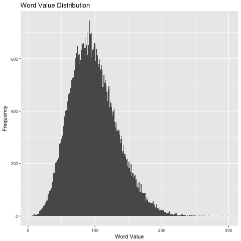
There are few words that catch my attention more than "coincidence", so after stumbling across this image I just had to dig a little deeper.
The morale behind the simple arithmetic is cute, but the argumentation is as weak as they come, using a single outlier example. What the image fails to mention (or, more accurately: voluntarily omits) is all the positive words that also miss the 100(%) mark, and even most importantly all the negative words that also had a perfect score of 100(%).
It doesn't take long to pull all words from the english language and score them based on alphabetical position. The resulting histogram is actually very pretty (and yet another display of how the Gaussian distribution is everywhere!):
Any clue on what the highest scoring word is? Well COUNTERREVOLUTIONARIES scores 299, no word scores in the 300s.
But back to our original question, it turns that while Knowledge and Hardwork both miss the mark, ATTITUDE and 656 other words score a perfect 100! It turns out that 100 is just slightly greater than the mean (98) and median (95) of word scores, so a PLETHORA (scores 95) of words obtain the perfect score of 100, among which these SINGULAR (scores 101) words:
Hopefully this post will bring some alternatives to all those with attitude problems who still want to reach 100% (oh and by the way, 100% of what??). And don't forget that BULLSHIT (103) will always get your further ahead!
Everybody knows the TV series X-files. We've all seen at least one episode in the 90's.
I was never a huge fan, but definitely watched my share of episodes back then. So when I heard the series was kicking off again with the same two stars, David Duchovny and Gillian Anderson, thirteen years after the last episode, I thought I 'd take a closer look at how the original series performed and whether it had stopped at a sufficient level of popularity to warrant a follow-up (it's important to note that this is not a prequel or reboot, but just continues where we left off).
Here's the evolution of the popularity as measured by IMDB rating of each episode:
The first striking feature is the volatility in episode rating. In an old post I looked at similar plots for other popular TV series and the ratings were much more stable (over 80% of Friends' episodes were rated between 8.0 and 8.5). But here we can easily have a 6.2 episode follow an 8.9 one.
As I previously mentioned, I never was a huge fan, but I do remember that X-files episodes typically fell into one of two buckets: those focusing on the pretty complex alien conspiracy, and the one-offs independent episodes where Mulder and Scully investigated a weird murder somewhere. It could be that the volatility is partially explained by these two different episodes types. Unfortunately, classifying episodes according to this definition and compare their ratings is no simple task...
We can gain a different perspective by looking at Nielsen data, indicating how many viewers tuned in to each episode and what share of market the episodes had each week.
Rating points:
Households:
The storyline is somewhat different here. It would appear X-files started rather modestly in popularity, reaching a peak during the 4th/5th season, and then slowly trending back down, which most likely caused the end of the series in 2002.
The two new episodes have an IMDB rating of 8.6, 8.7, it will definitely be interesting to see if those relatively high ratings for X-files episodes are authentic reflections of episode quality or just avid fans who have been waiting 14 years for Mulder and Scully to reunite!
Also to note: as I was writing this post, the new season was originally classified as a new series starting at season one, but has now merged into the original series as season 10.
Essentially all reviews I have read of the latest Star Wars installment, The Force Awakens, discuss how well J.J. Abrams was able to rekindle with the spirit of the original trilogy (Episodes 4, 5, 6).
Of course, as mentioned in Christopher Orr's critic excerpt, we do see many familiar faces we had grown attached to from the first trilogy and whom we missed in the second trilogy prequel. But can introducing some of our old friends back in the script be enough to recreate the environment we last saw over 20 years ago? Or was J.J. Abrams really able to go beyond the quick solution and put his heart in mind into reviving the magic?
There are many ways to approach the question, but I wanted one that would rely more on statistics than a degree in film studies. My angle was to perform a clustering analysis on the seven movies, solely relying on the dialogues. I found those at http://www.imsdb.com/scripts/. Formatting differed from movie to movie so slightly painful to get everything in a suitable format...
I then characterized each movie by the frequency of words, and looked at which movies were most similar to each other in terms of what is said. A few comments:
frequency of occurence was normalized by number of words so comparisons were fair (episodes 5, 6 and 7 have much less dialogue than episodes 1 through 4)
common english words typically referred to as stopwords in text analysis ("and", "I", "in", "was"....) were removed
planet and character names were also removed (Han Solo doesn't even exist in episodes 1-3)
The results from the hierarchical clustering are plotted here:
What does this tell us? Well it seems that just from a frequency of word analysis, one could almost reconstruct the trilogies! Episodes 1, 2 and 3 were lumped together on the left, episodes 4, 5 and 6 together on the right. As for episode 7, the algorithm added it to the original trilogy cluster.
What does this tell us? Well, it would appear that purely from a dialogues perspective, J.J. Abrams and other writers did a very impressive job in maintaining the original look and feel of the first trilogy by using the same lexical field. As an example, in Episodes 1, 2 and 3, the word "jedi" appears in dialogues approximately 11.9 times for every 1000 (non-stop) words. In contrast, that value is 2.6 for Episodes 4, 5 and 6. For The Force Awakens, the value is 2.4. This is one of the many signals which led the clustering algorithm to find Episode 7 "closer" to the first trilogy than the second.
From a modest stat perspective of dialogues, kudos to J.J. Abrams for a perfectly well-executed "retro" style!
Stay posted, this post will be updated quite regularly in the next few years...
As for most parents out there, a Lego set was part of the Christmas wishlist, and I found myself in front of an impressive display of options. As I was looking through the boxes, I noticed something while comparing these two boxes:
Extra information: the two sets are identically priced at $39.99....
So it's not completely easy to spot on the boxes, but despite the same price, the Ninjago box contains twice as many pieces (575) as the Frozen one (292). Ninjago is a line of set produced by Lego and therefore owned by Lego, while Frozen is the result of a partnership with Disney. Quickly scanning the different boxes, I seemed to some trend there: similarly priced sets appeared to have fewer pieces for themes that were the result of external as opposed to internally derived.
Having some free time on my hands during the Christmas break, I extracted as much data as I could for the LEGO site, pulling for each set the theme, the number of pieces and the price. I was able to identify close to 700 sets which provides a reasonable size for exploring some trends. Here are all the data points with number of pieces on the x-axis and price on the y-axis, and some jitter was added but not particularly necessary (prices tend to take discrete levels but not number of pieces).
A few observations:
the data is densely concentrated around the origin, the outliers on the scale make it hard to determine what exactly is going on there
there appears to be quite some variability in number of pieces for a given price point, which confirms my initial impression from the Lego store. Looking at the $200 vertical line, we see that there are boxes at that price with fewer than 1000 pieces, and others with over 2500!
overall, the relationship seems pretty linear along the lines of pieces = 10 * price, every $1 gets you about 10 pieces. I was more expecting a convex shape where each incremental piece costs a little less than the previous one, similarly to Starbucks where the larger the drink, the better the size-to-price ratio). I guess this can somewhat make sense: with food/drinks, two one-size units are equivalent to a two-size unit (if a gallon costs too much I'll just buy two half-gallons), but two 300 pieces Lego sets are not equivalent to a 600 Lego set, and so I guess Lego can afford maintaining the linear relationship.
And if you're wondering about the two data points in the upper right corner:
at 3808 pieces and $399, we have the tough-to-find Star Wars Death Star
at 4634 pieces and $349, we have the Ghostbusters Firestation (to be released into 2016)
Let's focus a little more around the origin where most of the data resides (92% of sets are priced less than $100):
Along the x-axis there appears to be a category of sets (green dots) consisting of just a few pieces but priced incredibly high. These are actually of the Mindstorm category. They are actually very sophisticated Lego pieces allowing you to build robots containing touch / light sensors that are sold separately at high price points. In the rest of this post, we will exclude the Mindstorm category, as well as the Power Functions category for the same reason. The Dimensions category was also excluded given that the pieces, while not as sophisticated as for Mindstorm and Power Functions, were quite elaborate based on their interaction with the Playstation console (average pieces-to-price ratio is about 3).
There appears to be another category with it's own specific piece/price relationship (red dots). While overall it seemed that every $1 was equivalent to about $10 pieces, this category seems to have a steep $1 for 1.5 pieces. This is actually the Duplos category for younger children, and the pieces are much larger than regular Legos. That being said, I'm wondering if Lego isn't taking advantage of all the parents eager to give their toddlers a head start in the Lego environment... Duplos are also thrown out for the rest of the post.
Back to our original question, how do the different themes compare to each other, and is there a price difference between internal and external brands?
The following boxplot provides some insight in the pieces-to-price ratio within each category. I've sorted them by decreasing median (higher median is synonym with a 'good deal', many pieces for every dollar). I've also color-coded them based on whether the theme was internal (red) or external (blue) to Lego.
Glancing at the graph, the two main take-aways are that:
there is strong variability within each category (in Star Wars for instance, the Troop Carrier set has 565 pieces for $40, while Battle on Takodana has fewer pieces (409) for a 50% higher price)
there does nonetheless seem to be a trend that internal themes have a better pieces-to-price ratio
We can try to explore the difference between the two types of themes via a linear regression, with a different slope and different intercept for each type:
The conclusion of the regression analysis is that the slopes for the two lines is not statistically significant (9.67 pieces/$ for external brands, 10.15 pieces/$ for internal brands), but there was a significant difference in intercept (50 fewer pieces for an external brand at the same price).
So in summary, don't feel Lego is completely overpricing you Disney Princesses or Star Wars figurines although there is a small pricing difference. If you do want the biggest bang for your buck, take a look at the Creator theme, and in particular here's the overall pieces-to-price winner (which I ended up getting my kid!):
Summertime rhymes with school break, fireworks, BBQ, but just as inseparable are Hollywood's big blockbusters. Early 2015, even as early as late 2014 we had teasers and trailers for the big upcoming wave of big budget movies, many of which sequels to blockbuster sagas. Terminator 5, Jurassic Park 4 anyone?
Starting early summer I pulled daily stats for 20 of the most anticipated summer movies of 2015, and before we enter the new year, let's see how they did.
Rating Evolution
In these two earlier posts I looked at the evolution IMDB scores after movies' releases, as well as after Game of Thrones episodes aired. In both cases we observed a trend in rating decrease as time went by, although this phenomenon was much more sudden for TV episodes (a few days) than for movies (multiple weeks / months).
Here's the trend for our 20 blockbusters, all aligned according to release date, and titles ordered according to final rating:
Again, we observe the same declining trend, although the asymptote seems to be reached much sooner than for the average movie (earlier analysis).
Straight Outta Compton clearly emerges as the best-rated movie of the summer although it did not benefit from as much early marketing as most of its competitors. Straight Outta Compton also distinguishes itself from the other movies in another way. While all movies dropped an average of 0.3 rating points between release date and latest reading (not as dramatic as the 0.6 drop observed across a wider range of movies in the previous analysis already mentioned, as if summer blockbuster movies tend to decrease less and stabilize faster), Straight Outta Compton actually improved its rating by 0.1 (this is not entirely obvious from the graph, but the movie had a rating of 8.0 on its release date, jumped to 8.4 the next day, and slowly decreased to 8.1). Only two other movies saw their ratings increase, Trainwreck from 6.2 to 6.5 and Pixels from 4.8 to 5.7, the latter increase while quite spectacular still falls way short from making the movie a must-see, despite the insane amounts spent on marketing. As you might have noticed from my posts, my second hobby is basketball, and I remember this summer when not a day would go by without seeing an ad for Pixels on TV or on websites where NBA stars battled monsters from 1970 arcade games.
Which brings us to the next question: did budget have any effect on how well the movies did, either from a sales or rating perspective? Of course we are very far from establishing a causal model here so we will have to satisfy ourselves with simple correlations across five metrics of interest: IMDB rating, number of IMDB voters, movie budget, gross US sales and Metascore (aggregated score from well-established critics).
I would have expected the highest correlation to be between IMDB rating and Metascore (based on another analysis I did comparing the different rating methodologies). However, it came at second place (0.73) and I honestly had not anticipated the top correlation (0.87) between budget value and number of IMDB voters. Of course we can't read too much into this correlation that could be completely spurious, but it might be worth confirming again later with a larger sample. If I had to give a rough interpretation though, I would say that a movie's marketing spend is probably highly positively correlated with the movie's budget. So the higher the budget, the higher marketing spend and the stronger 'presence of mind' this will have on users who will be more likely to remember to rate the movie. Remember my example of all the Pixels ads? I didn't see the movie, but if I had, those ads might have eventually prompted me to rate the movie independently of how good it was, especially if those ads appeared online or even on IMDB itself.
But while we wait for that follow-up analysis, we can all start looking at the trailers for the most anticipated movies of next year, sequels and reboots leading the way once again: X-Men, Star Trek, Captain America, Independence Day...


