Tuesday, January 29, 2013

Avocado's Number

Realizing I needed to do a better job of balancing seriousness and casualness, here's a quick joke I came across the other day and just needed to share:


Person 1: How many avocados do I need to make guacamole? 
Person 2: Avocado's number, 6.022E23 avocados/guacamole!

Seems like Trader Joe's is geekier than I thought:


OK, back to the draft for my next post, it's going to be a biggie!

Tuesday, January 22, 2013

From "Will they be champs?" to "Will they make the playoffs?"


I have not posted any basketball-related articles since sharing my data-driven predictions for the 2012 NBA Finals (unfortunately for me, the data suggested the Oklahoma City Thunder had a slight advantage against the Miami Heat).

But there has been SO much talk recently on the Los Angeles Lakers' performance that I just had to take a stab at predicting their season outcome.


Background

For those of you not too familiar with the situation, it has all the drama of a Hollywood script, and I will briefly summarize the situation.

The Lakers have had great results in the past years, winning the championship in 2009 and 2010, and being tough opponents in the other years. Over the 2012 summer and a disappointing 2012 year, they signed a couple of superstars: Steve Nash from Phoenix, desperate to win a championship and one of the league's top point guards, as well as Dwight Howard from Orlando, who can be quite a beast under the basket. On paper they were an All-Star team, nobody contested that. Almost everyone had them reaching the Finals, the only question was whether they would beat Miami or not.

But their performance so far surprised even the most pessimistic: they started the season by accumulating losses, and have lost more games than they have won since the start of the season. Things get worse as they are in the Western Conference which is much more competitive than the Eastern conference. Add in a fired coach, a surprising replacement coach, and you have all the drama necessary for a lot of ink to be poured!

Total confusion on the court has been a common sight in the Staples Center:

And so the questio has become: will the Lakers even make it to the NBA playoffs? Only the best eight teams of the Western conference make the playoffs. Many analysts have looked at historical data, noticing that the eight team in the West has an average of 48 wins, and if the Lakers want to reach 48 wins this season they need to start winning fast.

I've decided to take a slightly different approach, by tring to forecast what the rest of the season would look like for all teams based on the first half of the season. Also, the previous methodology ignores what the rest of the teams are doing in your conference, as well as the impact of playing another team also fighting for a playoff spot. When you win against one of those teams, it basically counts double!


Methodology

Here's the methodology I've taken:
  • extract all of the 2012-2013 season scores and schedule data for all teams, namely home and away winning percentages
  • for all upcoming games I compute the home team's probability of victory as follows:
    home team winning percentage / (home team winning percentage + away team winning percentage).
    For example: Let us say that Chicago with a 12-5 road record (70.8% road winning percentage) is visiting Miami with a 16-3 home record (84.2% home winning percentage), I would estimate Miami's probability of winning the game as:
    84.2% / (84.2% + 70.8%) = 54.4%.
  • Based on this probability, I simulate the game's outcome and then update Chicago's and Miami's records (if Chicago wins, their road record is now 13-5 and Miami's home record becomes 16-4).
  • I continue proceeding that way until all the season's games have been simulated. This then becomes one possible outcome for the season.
  • I then repeat the entire process outlined above thousands of time to get an idea of all the scenarios that can play out.
Based on the simulations, I can then determine which teams are most likely to have the best record in the NBA, and, going back to our original question, how likely the Lakers are to make the playoffs.


Results

Here are the results (based on scores up to 21/01/2013):

Top three NBA records:
  • First place:
    Oklahoma City Thunder (32.9%), San Antonio Spurs (29.2%), Los Angeles Clippers (28%)
  • Second place:
    San Antonio Spurs (26.6%), Oklahoma City Thunder (24%), Los Angeles Clippers (23.4%)
  • Third place:
    San Antonio Spurs (18.7%), Oklahoma City Thunder (17.6%), Los Angeles Clippers (17.1%)
Clearly, the odds are that these three teams will enter the playoffs with the best records and so most likely a Western Conference team will have homecourt advantage in the Finals!

As for the Lakers, here are the probabilities of their final standing in the Western conference:

Position Probability
6 0.4
7 1.4
8 4.1
9 8.9
10 12.6
11 18.1
12 24.2
13 16.9
14 10
15 3.4

Wow! Only a 5.9% probability of the Lakers making the Playoffs!

But let's still monitor them closely, and I'll update these results in the weeks to come.

Please leave a comment if you have any questions/suggestions on the methodology and/or results!


Monday, January 21, 2013

2013: Year of Statistics (and this blog!)


Quick post to remind everyone that 2013 is officially the year of statistics!

The official site is http://www.statistics2013.org/, and has tons of information on what statistics are (not just for sports) and what statisticians do (not just bore people at parties).

If you only want a two-and-a-half minute overview of how cool statistics are, than here's the summary video:


http://www.youtube.com/watch?feature=player_embedded&v=nTBZuQR7dRc

It's been a quick post I agree, but I'm working on quite a bunch of stuff I'm hoping to add really soon!


Tuesday, January 15, 2013

Does chocolate consumption increase the number of articles on correlation VS causation?


On October 18th 2012, the New England Journal of Medicine published a paper linking chocolate consumption and Nobel prizes by country. I’m sure you’ve heard about the study, it went pretty much viral after that, people found it cool to post and re-post on Facebook, Twitter…

There have also be countless articles on the topic, and while the methodology and approach of the original paper are highly debatable (and actually there is quite some talk about the paper being a joke from the New England Journal of Medicine), I still found something very troubling in how the results of the paper were paraphrased amongst journalists and friends.

To recall the setup, Franz Messerli (happens to be Swiss), looked at chocolate consumption per capita and number of Nobel Laureates per 10 million people across 23 countries, and found the following results:


All 23 data points, with the slight exception perhaps of Sweden and Germany, seem to fall on a straight line! And Pearson’s correlation coefficient of 0.791 is statistically significant!

I haven’t read the paper myself but the last part seems to attempt to explain the phenomenon, namely by the increased cognitive abilities derived from higher chocolate intake.

But as I mentioned, the headlines of articles reporting the findings hurt me the most, ranging from the conservative interpretation (Does chocolate make you clever?, and Eating chocolate may help you win Nobel Prize) to the absurd leapfrog conclusions (Why Do the Swiss Eat So Much Chocolate?, Secret to Winning a Nobel Prize? Eat More Chocolate).


Of course, journalists need to shoot for the sensational, but the misunderstanding between correlation and causation is a very real and widespread one, and so I thought I would use the Chocolate / Nobel Prize example to illustrate how the two concepts differ.


  • The first hypothesis could be that this was just a random coincidence and that countries not satisfying the “model” were dropped out (think of all the top IQ countries).

  • An alternative (third variable) could be that countries in northern Europe tend to eat more chocolate and tend to have more laureates per capita. Do they have longer and colder winters? Because of the long winters you tend to eat more chocolate to improve morale? Because of the long winters you tend to eat spend more time studying than if you had a warm sunny beach outside? And haven’t sociologists linked long cold winters to increased suicide rates and crimes? (this is what led me to take a closer look at crime-related variables)


To do so, I will first replicate the original analysis as closely as possible, but also look at some additional metrics.

I was not able to pull the original dataset, so searched the web as best as I could to find chocolate consumption numbers and Nobel prizes per capita.


As boasted in the paper, I also got a great correlation, albeit not as significant (0.658 instead of 0.791). First little red flag, it appears that the number is quite volatile and rather data-sensitive. While it is hard to lie about Nobel Prize laureates, one might wonder if there even is anything such as an official chocolate consumption database?

Step 2 consisted in looking at another metric which is theoretically tied to Nobel Prize winning according to the paper: cognitive ability. Of course the first proxy that comes to mind for this metric is IQ. I therefore replicated the analysis looking at correlation between chocolate consumption and IQ.


Wow, the value dropped to 0.279! Even more troubling: only one of the top top IQ countries (Japan) was from the original analysis as there was no chocolate consumption data for them. Second red flag: why were only 23 countries included in the original paper?
So chocolate makes you smart enough to win a Nobel, but not enough to increase IQ?

But why settle on Nobel prize laureates and IQ, why not look at a whole set of metrics and test their correlations with chocolate consumption? With feminine intuition from my wife, I started focusing on crime-related metrics, and here are the results:

Kidnappings, correlation = 0.11


Drug offenses, correlation = 0.42


Rape victims, correlation = 0.45


What about total crimes per capita?


Correlation of… 0.72 !!! Even higher than for Nobel Prize! Stop eating that chocolate right now, or you will end up in jail before you know it!

So taking a step back, what have we shown? Well the first point is that if you compare enough metrics to each other, you are bound, just out of pure chance to come up with high correlation that does not mean anything. Just like if you flip a coin enough time (in the sense of quit your job right now) you are bound to get 20, 30 even 100 consecutive heads.  Does it mean anything? No, you just lost your whole life for nothing.

The second important point is that there could be some link between the two metrics in question. But it does not mean that metric 1 impacts impact 2! Nor does it mean than metric 2 impacts metric 1! (the article never wonders whether Nobel prize laureates could have enough appetite for chocolate  to lower their countries average consumption value). It could very well be that there is a third metric impacting both metric 1 and metric 2. The example I like best from my stats class is: does carrying a lighter increase your risk of getting lung cancer? Of course not why would it? Even if I told you there was a strong correlation between the two? Hmmmm. But here’s the thing, you are actually without knowing it comparing smokers to non-smokers. Smokers tend to have a greater probability of carrying lighters around, and of having greater risk for lung cancer. But carrying a lighter does cause lung cancer, and having lung cancer certainly doesn’t make you more prone to carrying a lighter!


OK, back to chocolate. What’s going on behind the scenes and behind the nice straight line? As discussed previously, there could be one of two phenomena going on:

Go ahead and eat all the chocolate you want, but hold off on booking that flight to Oslo…

I would also like to point out this article by James Winters and Sean Roberts which features a surprisingly similar analysis to mine (looking at IQ then at serial killers). Nobody copied anybody, I was just relieved to see I wasn’t the only one finding for correlation VS causation!


Sunday, December 9, 2012

Genetics and Regression toward the mean

"Regression toward the mean" is a common term coined in many different fields (sometimes quite abusively), but I wanted to take a quick look at it from a genetics perspective, given that this is actually where it originally comes from.

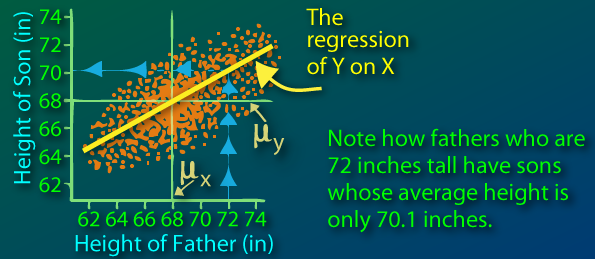
Sir Francis Galton first observed this phenomenon when comparing parents' heights to children's heights, and noticed that while there was a strong correlation between the two, there was also this phenomenon of extreme parent heights leading to less extreme heights in offsprings. As heights from one generation to another became less and less extreme and trended towards some constant, later identified as the mean, the expression "regression toward the mean" appeared.

(from http://www.animatedsoftware.com/statglos/sgregmea.htm)

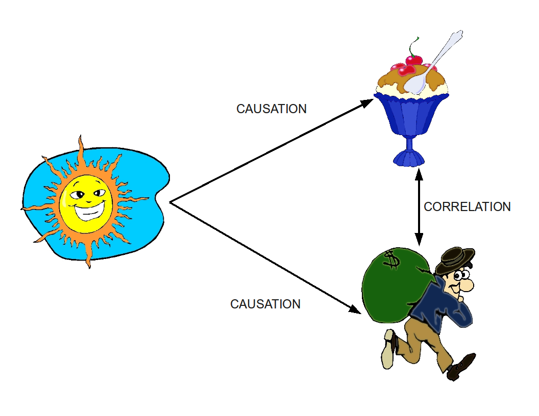
Now an obvious paradox comes out from this: if all heights become less and less extreme and converge wouldn't we all be of the same height today? How is diversity maintained?

As mentioned I will look at this from a genetics perspective under some simple assumptions.

First model

To kick things off, I will consider a certain trait such as height, and assume that each child will have the average height of his two parents. For simulation purposes, I will consider a population of 100 males, 100 females, and each couple having exactly two children, one boy one girl in order to maintain population size and composition. The physical trait of the original population is generated via a discrete 0-100 uniform distribution.

Let's see how this evolves over 20 generations:
The green line represents the population average for the trait, the blue region the inter-quantile range (25th to 75th quantile, indicating that 50% of the population has a value in this range), and the gray delimits the min and max range of the population, so that 100% of the population is within the colored regions).

The population average remains constant which makes sense: if the children's height is the average of the parents' height, the average height of the new generation is going to be the same as for the previous generation. We clearly see the regression toward the mean in effect, the speed of convergence is rather fascinating. While we have a min and max of 0 and 100 in the first generation, the entire population has a value between 49 and 55 in the 10th generation.

Our assumption that the physical trait is the exact average of both parents is a stretch and few traits are passed on this way. Let us look at a more biologically-accurate model.


Second model

How is genetic information actually passed on from generation to generation? I will not go into the full details, but we know that we actually inherit two copies of each gene, one from mom one from dad. Assuming their is a gene that directly controls height, dad will send one version of this gene (called allele), and so will mom. Since they themselves have two copies of each, there is a 50/50 chance of which one my dad will give me, same for mom.

(from http://cikgurozaini.blogspot.com/2010/06/genetic-1.html)

So let's take another model which replicates this. Each parent has two alleles (again we draw from a discrete 0-100 uniform distribution) and randomly passes one to the offspring.
We also assume that the value we observe for the individual (phenotype) is the average of these two values.
So if dad has 10 and 50, we will see him as a 30, and if mom is 30 and 90, we will see her as a 60.
What about the offspring? Well, here are the possible outcomes:

  • 25% chance the child will be 10 and 30 (phenotype 20)
  • 25% chance of being 10 and 90 (phenotype 50)
  • 25% chance of being 50 and 30 (phenotype 40)
  • 25% chance of being 50 and 90 (phenotype 70)

Now this is where we see the regression to the mean effect: the expected value of the child is 45 (0.25 * 20 + 0.25 * 50 + 0.25 * 40 + 0.25 * 70), which happens to be the parents' average (0.5 * 30 + 0.5 * 60). But this is only an expectation, and diversity is maintained with the child's value possibly ranging from 20 to 70.

So what happens when we repeat the process over and over?
(For a reason I will explain later, I have increased population to 20,000 instead of 200 from the first model)


A thousand generations down the road not much has changed! Looking at the count of unique phenotypes and alleles confirms this population heterogeneity:


The expectation is for children to have their parents' average height, but random mix-and-matching ensure diversity. Also note that mutations can occur, thus creating newer alleles!

This model, much more accurate both from a genetics standpoint and from what we observe in our everyday life, explains the paradox behind the original regression toward the mean: it's not because the expectation is the mean that you will converge towards it.

So there we have it, regression toward the mean does not imply we will all be clones of each other down the road!

Side note on population increase:
At the start of the second modeling phase, I had mention I had increased the size of my population from 200 to 20,000. This is because alleles can disappear in small populations: If dad has alleles a1 and a2 and two kids, the probability that a1 never gets passed on is 25%. So at each new generation, each parental allele has a 25% probability of disappearing  Of course allele a1 could be present for another parent who might pass it one, but the fact remains that all alleles are in constant risk of not being passed on. When simulating over many generations, this is actually what happens, and once a given allele disappears within the population, it can never be generated again (forgetting mutations for an instant).

Looking at a population of only 200 individuals:

After 1000 generations, the entire population has converged to a unique height. The loss of alleles (and thus phenotypes) can be viewed here:
The number of unique alleles is decreasing as alleles can disappear but never re-appear. As for the number of phenotypes it can increase. Indeed, suppose mom and dad are both 10-30 (same phenotype of 20), their offspring can be 10-10 (phenotype 10) or 10-30 (phenotype 20) or 30-30 (phenotype 30) so potentially three different phenotypes. The number of phenotypes is nonetheless going to be driven by the number of alleles. The less different alleles there are in the population, the less different combinations you can create.

If we increase the sample size, we decrease the probability of alleles disappearing. It would be quite unlikely for all parents with allele a1 to not pass it down to their children! However, theory around random walk indicates that this is inevitable after sufficient generations, no matter the size of the population (this is what we started to observe in our 20,000 population with the number of alleles starting to decrease around generation 400).


Saturday, September 22, 2012

Evolution of movie ratings


We've all checked a movie's IMDB rating to decide whether to go see it at the movies, but ever notice how the rating seems to drop when you check a few days later?

We here look at the evolution of 18 movie's ratings before/after their release to see whether this holds on this very small subset.

The hypothesis would be that there is self-selection bias in a movie's ratings, with die hard fans being the first to go see it (most often before its official release) and rate it, but because of their die hardness rating it higher than the average audience member.

For the 10 movies of interest I extracted (almost) daily ratings. Then, for each movie I compare the daily ratings to the rating on day 0 as baseline. This is defined as "IMDB rating delta" in the following graph:

Despite the small sample size, we can clearly see a decreasing trend starting a few days before release and continuing downwards two weeks after the official release. On average, movies, lose 0.4 out of 10 in IMDB rating over that period.

After the second weeks, things start to stabilize somewhat, as the number of ratings increases and we tend towards the movie's final long term rating. Based on the plot it seems as if there is a slight increase from week 2 onwards, but this is most likely due to the small sample size which gets even smaller in the future (while I have day 0 data for all movies, I do not necessarily have day 30 data for all).

But what about the metascore (aggregated score from www.metacritic.com based on "official" critics)? The same type of plot can be generated:


The pattern is here somewhat the same with a sharp decrease right around release date, but stabilization is much quicker. This makes sense since, as noted in the earlier post on individual movie evolutions, critics tend to publish their opinions right around release dates, not weeks after.

Hopefully I will be able to extend the analysis to more movies over greater time periods, but data extraction is in real-time unfortunately, no "back to the future" to speed things up ;-)

Friday, August 17, 2012

The Dark Night Released


Today I wanted to take a closer look at the evolution of a movie's metrics around its release time. Do ratings go up, down? How long does it take for the ratings to stabilize? What about a movie's metascore (aggregated score from www.metacritic.com based on "official" critics)?

To kick this off, I looked at three movies for which I had sufficient data: Ice Age 3, Savages and the Dark Knight Rises. I was also interested in the Dark Knight Rises to see if the events surrounding the Aurora shooting had any impact.

Ice Age 3: Continental Drift

For this move the number of voters really jumped the week after the release (dashed vertical line).

As for the rating it dropped from a 7.1 pre-release "hype" to stabilize itself at 6.9. Interesting to see how quickly it stabilized (aside from the mini bump the second week, the rating of 6.9 was achieved the same weekend the movie was released).

Metascore followed a similar evolution with a sharp decrease right around release date. The stabilization in rating makes more sense as not many magazines and newspapers review the movie after its release.


Savages

Unfortunately I was not able to gather any pre-release data for this movie, but interesting to see again that the biggest jump in IMDB voters occurred two weeks after release.

Again, the rating very quickly stabilized a few days after release to 6.8.

 The metascore dropped fairly late although only by one point.


The Dark Knight Rises

 Despite trying to pull IMDB data up to two weeks in advance I was not able to collect any pre-release data for the third installment of the Dark Knight series.

Ratings dropped steadily from 9.2 to 8.9 over two weeks, again suggesting a fairly quick stabilization, especially as the number of voters increases.

The metascore had a sharp dropoff right around the release date, and the shooting, although it is unclear if there is any type of relation. Based on our very limited sample size it seems that metascore and rating always tend to drop around the release.


I am currently pulling more data for these movies and 15 others, so come back to check updated and new results. I will also try a meta-analysis to see if there is some common pattern in the evolution of the metrics across all movies.