Showing posts with label 2014. Show all posts

Tuesday, January 6, 2015

Fifteen seconds remaining, down by one....Who you gonna foul?


I was following the Mavericks - Kings game earlier this year. Exciting game which went into overtime. With 50 seconds left and the Kings down by two, Rajon Rondo fouled Jason Thompson and in the process sent him to the free throw line. He made the first shot. But before he could attempt the second, the Mavs called a timeout. After the timeout, Jason went back to shoot his second free throw, and missed it.

Did the timeout have any impact on the missed shot? You couldn't make a free throw any more straightforward. Unlike a penalty kick at soccer, there's nothing your opponents can do to alter that shot. Except call a timeout? Legendary coach Phil Jackson was (in)famous for calling timeouts between opponents free throws, but was this ploy effective at all? Thompson could have tied the game on his second free throw attempt, which would have shifted a considerable amount of pressure of his and his teammates' shoulders with less than a minute to go. With the timeout called, Thompson was left there brewing in these thoughts with mounting pressure.


That game made me want to investigate the timeout phenomenon, as well as other external factors that could influence the outcome of a free throw. I also wanted to follow up on an earlier post I made about measuring players' clutch performances via statistical models.

A few words on the data before jumping into the analysis. I focused on the most recent complete NBA season: 2013-2014. I pulled all the play-by-play data from nba.com, and pulled free throw season percentages for each player from espn.
Quite a bit of cleaning up was required, namely around players with same last name and same team the worst example being the Morris twins in Phoenix who also share same initial!
After cleaning everything up, I was left with just under 56K free throws taken in that season, ready to be analyzed!

I was primarily interested in the impact of free throws interrupted by timeouts, but also wanted to capture two additional factors: whether the shooter has homecourt advantage or not, and whether the situation is "clutch". There are countless definitions of "clutch time" available, some sparking heated debates. I have here defined it as "less than 2 minutes to play in the 4th quarter or in overtime, and less than 5 point differential between the teams' scores".

Before jumping into the data and analysis, let's first do some visual explorations.

How many free throws are taken by quarter?

Not surprisingly, significantly more free throws are taken in the fourth quarter than the first. The game is on the line, the defense goes up a notch, and voluntary fouls are committed to regain ball possession and prevent the opponent from running down the clock.

We can even go down one granularity level at look at the number of free throws made by minute played. Rather impressive to visualize the steady increase throughout each quarter, and the giant spike in the final minute of regulation with teams fouling on purpose in tight games.


We've looked at volume, let's know look at efficiency. How well do the home and road teams shoot the ball?


It appears that both teams shoot at very similar rates throughout the contest, with the home team always having an advantage although it is not a significant as one might have expected given the distractions often displayed by the home fans.


Both teams seem to do better in overtime, but we need to caution against the much smaller sample size there.

And now to the more interesting piece, how do teams execute in clutch time?


Quite surprisingly, the home team appears to be performing no differently, whereas the road team gets a nice boost of almost 5%. The fact that we observe a boost might seem counterintuitive for some: under pressure, with fatigue from close to 48 minutes of gameplay, wouldn't it be more difficult to concentrate and sink the shot? However, a reverse argument could be made that especially when games are close, or when a team expects the other one to intentionally foul, the coach might chose to place his best shooters on the floor. So teams aren't necessarily shooting better, just having better shooters take the shots. This however does not fully explain why the road team has a boost and not the home team.

The following graph shows the 1st quantile, median and third quantile for season free throw percentage of the players taking shots in and out of clutch. It is rather apparent that better shooters are on the floor in clutch moments.


Now that we have a better feel for the data, the analysis can begin. The data is extremely rich and offers multiple options from a statistical analysis point of view. We can leave the baseline free throw shooting percentages for each player be determined by the model fitting, or force these to be the players' season averages. But with different players taking a very different number of free throws within a season, and strong dependency in the success of a free throw for all those taken by the same player, a hierarchical structure emerges and a mixed effects model could make sense.

I actually played around with the three options just mentioned, and was satisfied at how close the numerical outputs were to each other.

The conclusions would indicate that:
  • homecourt does have a positive effect on shooters' success, although the effect was only borderline significant
  • calling a timeout before the second (or third) free throw had a negative but insignificant impact
  • clutch time had a negative and significant impact

Regarding timeouts, the fact that the effect was not significant could be due to the low sample size of these events (84 cases in 2013-2014 out of 56K free throws taken), more coaches should test this strategy so I can tell them if it's effective or not!

As for clutch time, the conclusion seems to contradict the visual exploration where percentages were higher in clutch time. But recall that our explanation to this was that the coaches were putting better shooters on the court. The analysis would indicate that even if the best shooters are on the floor in the closing minutes, they are individually performing less well when the game is on the line than in the middle of the second quarter.

Now one might wonder if we could use the data to detect some of the leagues best clutch free throw shooters. Those cold-blooded killers who can step it up an extra notch when all eyes are on them. The Durants, James, Bryants...

I added some interaction terms for players with sufficient (20) in and out of clutch time free throws and see which ones had the potential to elevate their game. And the results are... no one! Out of the 26 players meeting my criteria, none could significantly increase their free throw percentage. This could again be due to small sample size, but even so most players had negative coefficients. While none had significant positive coefficients, two had significant negative coefficients: Chris Paul and Ramon Sessions.

So back to the post's title, if you're playing the Clippers, fifteen seconds to go and down by one, do you foul Chris Paul?


Thursday, April 17, 2014

Infographic: Fight for the Eastern Conference #1 Seed

All season-long, Indiana set the #1 seed as their objective. While the Pacers completely dominated the first half of the season, they crumbled after the All-Star break (at the same time that Miami and Oklahoma) letting San Antonio capture the overall seed.

But while the overall top seed slipped through their fingers, keeping their grasp on the #1 Eastern conference seed against Miami was a nail-bitting battle till the last few games of the season.

The following infographics show which team had the best winning percentage throughout the regular season. The line is blue when Indiana has the best percentage, red when Miami had it.


Overall season evolution:


Since the All-Star break:


From a 'Ganes Behind' perspective:


Thursday, April 10, 2014

Best of the West or best of the rest?

The NBA finals are right around the corner. Only a handful of games are left to be played in this 2013-2014 season, and homecourt advantage is still a hard fought battle for the top teams.


Miami wants it to increase their odds of winning a third straight championship, Indiana wants it to turn the tables if (more like when) it meets Miami in the Eastern conference finals and avoid a game 7 in Miami like it did last year, San Antonio wants it for the exact same reason except it lost to Miami in game 7 of the finals, and OKC wants it in case it faces Miami in the finals (plus it could provide Kevin Durant with an additional edge on the MVP race against LeBron James).

So yes, everyone wants homecourt advantage, it's been proved over and over again (including in this blog) that there is a definitive advantage to playing 4 games instead of 3 at home in the best-of-7 format. But how key is it really? Does homecourt advantage really determine the NBA champions? Do other factors such as the conference you are in or the adversity faced in the first rounds play a part?

Following on the tradition of the past years, the West is clearly better than the East. Consider this: right now, the Phoenix Suns hold the eighth-best record in the West with 46 wins and 31 losses, and has the last seed for the playoffs. But only two teams have a better record than that in the East, Miami and Indiana. Stressing to hold the last playoff spot in one conference versus a comfortable third seed in the other? Talk about disparity!

But if you had to guess whether the next champ was going to be from the East or West what would you say? That the eastern team would have an easier road to the finals, less games, less fatigue than their western counterpart? Or does evolving in a hyper-competitive bracket strengthen you, in a what-doesn-t-beat-you-makes-you-stronger argument?


Does the overall strength conference have an impact? Does the team with the best regular season record (and hence homecourt advantage) necessarily win? Does the team with the easiest path to the finals have an advantage?

To investigate this I've looked at all championships since 1990 (24 Playoffs) and looked in each case at some key stats for the two teams battling for the Larry O'Brien trophy, among these:
  • number of regular season wins
  • regular season ranking
  • sum of regular season wins for opponents encountered in the Playoffs
  • sum of regular season ranking for opponents encountered in the Playoffs
  • number of games played to reach the Finals
  • sum of regular season wins for all other Playoffs teams in their respective conferences
  • sum of regular season ranking for for all other Playoffs teams in their respective conferences
  • ...

So for Miami in 2013, the data would look something like:
  • 66 regular season wins
  • NBA rank: 1
  • played 16 games before reaching the Finals
  • 132 playoff opponent regular season wins (Indiana: 49, Chicago: 45, Milwaukee: 38)
  • 38.5 playoff opponent regular NBA ranking (Indiana: 8.5, Chicago: 12, Milwaukee: 18)
  • 320 playoff conference regular season wins (Indiana: 49, New York: 54, Chicago: 45, Brooklyn: 49, Atlanta: 44, Milwaukee: 38, Boston: 41)
  • 84.5 playoff opponent regular NBA ranking (Indiana: 8.5, New York: 7, Chicago: 12, Brooklyn: 8.5, Atlanta: 14 Milwaukee: 18, Boston: 16.5)
  • ...
As for the Spurs who were the other 2013 finalists, they had a worse record, emerged from a tougher conference and met stronger opponents while needing surprisingly less games to reach the Finals:
  • 58 regular season wins
  • NBA rank: 3
  • played 14 games before reaching the Finals
  • 148 playoff opponent regular season wins (LA Lakers, Golden State, Memphis)
  • 27.5 playoff opponent regular NBA ranking (LA Lakers, Golden State, Memphis)
  • 366 playoff conference regular season wins (Memphis, Oklahoma, Golden State, Denver, Houston, LA Lakers, LA Clippers)
  • 51 playoff opponent regular NBA ranking (Memphis, Oklahoma, Golden State, Denver, Houston, LA Lakers, LA Clippers)
  • ...


I then ran various models (simple logistic regression, and lasso logistic regression) to see how these different metrics helped predict who would win the champion come the Finals.

The conclusions confirmed our intuition:
  • having more regular season wins that your opponent in the Finals provides a big boost to your chance of winning (namely by securing homecourt advantage, but the exact number of games provided a much better fit than a simple homecourt advantage yes/no variable)
  • there were indications that having a tougher path to reach the finals (more games, tougher opponents) slightly reduced the probability of winning the championship, but none of those effects were very significant

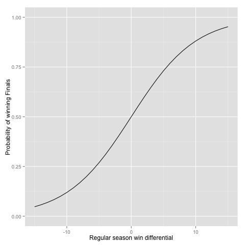
The effect from difference in regular season wins can be seen on the following graph, where we have compared two (almost) identical teams evolving in identical conferences. The only difference between the two teams is the number of wins they've had in the regular season, shown on the x-axis. The y-axis shows the probability of winning the championship.


A five-game differential in wins will translate with a 73% / 27% advantage to the team with the most wins. Only a one-game advantage translates into a 55% / 45% advantage.

The conference effect appears quite minimal, and home-court advantage appears to be key. If Indiana hates itself right now for having let the number 1 seed in the East slip through its fingers, it can always try to comfort itself with the fact that (unless a major San Antonio / Oklahoma / LA Clippers break down occurs over the remaining games of the season), the Western team making it to the Finals would have held homecourt advantage no matter what.

It should also be noted that a "bad" conference isn't synonym of easy opponents. Just look how Brooklyn seems to have the Heat's number this year, the way Golden State had Dallas' in 2007 when it beat the number 1 seed in the first round. All season long the Golden State Warriors were the only ones who could match up against Dallas really well.

UPDATE: as of yesterday, Indiana has reclaimed the top seed in the East, but the final argument can be applied to Miami just as well. Whichever of these teams makes it to the Finals will face a tough opponent.


Friday, February 14, 2014

Easy tips for Hollywood Producers 101: Cast Leonardo DiCaprio! (but cast him quick!)

My wife and I were thinking of going out to see "The Wolf of Wall Street" the other day. Why did this movie catch our eye more than the other twelve or such showing at our local movie theatre?


Had we heard great reviews about it? Nope. Had word-of-mouth finally reached us? Nope. Had we fallen prey to a cleverly engineered marketing campaign? Well yes and no.

Not owning a TV at home, so the least you could say is that our TV ad exposure was quite minimal. And as far as I can remember (although one could argue that this is exactly the purpose of sophisticated inception-style marketing) we din't see that many out-of-home ads nor hear any radio ones. Marketing was involved, but the genius of the marketers behind "The Wolf of Wall Street" was restricted to creating the poster, and not because of the monkey in a business suit nor the naked women, but simply by putting Leonardo DiCaprio right there. My wife and I's reasoning was simply that any movie with Leonardo had to be good.

Now don't go and write us off as Titanic groupies/junkies. I won't deny we both enjoyed that movie, but we don't have posters of him plastered all over our house. But here's the question we found ourselves asking: Can you name a bad movie with Leonardo in it? And harder yet: a bad recent movie with him in it?

Made you pause for a second there didn't it? Few people will argue against the fact that Leonardo is a very good actor and that his movies are generally pretty darn good. But are we being totally objective here? How does Leonardo's filmography compare to that of other big stars? The Marlon Brandos, Al Pacinos, De Niros, Brad Pitts...?

In order to compare actors' filmographies, I turned to my favorite database from IMDB. IMDB has a rather peculiar way of listing actors, directors, producers in its database, and I was unable to find a logic between the individual and the index in the database. But I did notice that all the big actors I wanted to compare Leonardo to had a low index (never above 400), so decided to pull data for all indices less than 1000. Now in the process I got some directors or actors with very few movies, so excluded from the analysis anybody have acted in less than 10 movies. The advantage of pulling this way was the fact that it provided a very wide range of diversity in gender, geography and time. So we have Fred Astaire, Marlene Dietrich, Louis de Funès, Elvis Presley...And to get an even broader picture, I added 30 young rising new stars to the mix. All in all, 826 actors to compare Leonardo to.

Going back to our original question of how good Leonardo is, I've looked at two simple metrics: ratio of movies with an IMDB rating greater than 7, and ratio of movies with an IMDB greater than 8. So how well did Leonardo do? The mean fraction across the actors was 22% for the 7+ rating (median 20%). Leonardo had... 55%! That's 16 out of his 29 movies! Only 15 actors have a higher score. Top of the list? Bette Davis, with 76 of her 91 movies (83.5% having a 7+ rating). The recently deceased Philip Seymour Hoffman also beat Leonardo with 31 out of 52 (59.6%). Fun fact, what male actor of all times has the best ratio here? You have to think out of the box for this one as he's more famous for directing than acting, yet makes an appearance in almost every one of his movies. That's right, Sir Alfred Hitchcock, has 28 of 36 movies (77.8%) rated higher than 7.

Name Number of movies Number of 7+ movies Ratio of 7+ movies
Bette Davis 91 76 83.5%
Alfred Hitchcock 36 28 77.8%
François Truffaut 14 10 71.4%
Emma Watson 14 10 71.4%
Bruce Lee 25 16 64.0%
Terry Gilliam 16 10 62.5%
Andrew Garfield 13 8 61.5%
Alan Rickman 44 27 61.4%
Frank Oz 31 19 61.3%
Daniel Day-Lewis 20 12 60.0%

What about for movies rated higher than 8? Leonardo does even better according to this metric! The average actor has only 2.7% (median 1.7%) of movies with such a high rating. Leonardo has 5 out of 29, 17.2%! And only 8 actors do better with this metric. No more Bette Davis (plummets to 3.2%), but replaced by Grace Kelly (3 out of 11, 27.3%) who tops the chart. Sir Alfred is impressive once again with 9 out of 36 (25%).

Name Number of movies Number of 8+ movies Ratio of 8+ movies
Grace Kelly 11 3 27.3%
Alfred Hitchcock 36 9 25.0%
Anthony Daniels 12 3 25.0%
Chris Hemsworth 12 3 25.0%
Terry Gilliam 16 3 18.8%
Elizabeth Berridge 11 2 18.2%
Elijah Wood 56 10 17.9%
Groucho Marx 23 4 17.4%
Leonardo DiCaprio 29 5 17.2%
Quentin Tarantino 24 4 16.7%

Now the big stars we mentioned earlier do pretty well, just not as good as Leonardo:

Name Number of movies Number of 7+ movies Number of 8+ movies Ratio of 7+ movies Ratio of 8+ movies
Marlon Brando 40 18 4 45.0% 10.0%
Brad Pitt 48 23 6 47.9% 12.5%
Robert De Niro 91 32 8 35.2% 8.8%
Leonardo DiCaprio 29 16 5 55.2% 17.2%
Clint Eastwood 59 19 6 32.2% 10.2%
Morgan Freeman 69 24 7 34.8% 10.1%
Robert Downey Jr. 68 17 1 25.0% 1.5%

Another thing worth repeating to put these numbers in perspective: we are not comparing Leonardo to your "average" Hollywood actor. Because of the way IMDB has matched actors with indices, we are comparing Leonardo to some of the greatest of all times here!

Remember how earlier one we mentioned that it was even harder to find a recent bad movie by Leonardo? Let's look at his movie ratings over time to confirm this impression:


Wow. With the exception of J.Edgar in 2011, every single one of his movies since 2002 (that's over this last decade !) has had a rating greater than 7! 12 movies!

Now one might argue that there is a virtuous circle here: the more you become a star, the easier it is to get scripts and parts for great movies and do the easier it becomes to continue being a super star. For each actor in my dataset, I ran a quick linear regression to see improvement of movie rating over time. Leonardo stands out here quite a bit too, for he is among the rare actors to have positive improvement. The "average" actor's movie lose 0.01 IMDB rating points per year, Leonardo gains 0.1 per year, putting him in the top 15 of the data set:

Name Number of movies Number of 8+ movies Number of 7+ movies Improvement
Taylor Kitsch 11 1 2 0.26
Rooney Mara 11 1 4 0.26
Justin Timberlake 18 0 3 0.23
Chloe Moretz 24 1 6 0.19
Bradley Cooper 26 0 7 0.18
Juliet Anderson 50 1 12 0.17
Mila Kunis 23 1 3 0.16
Chris Hemsworth 12 3 7 0.15
Tom Hardy 27 3 12 0.14
Andrew Garfield 13 0 8 0.12
Mia Wasikowska 21 0 9 0.12
Barbara Bain 14 1 2 0.11
George Clooney 38 1 15 0.11
Jason Bateman 32 2 9 0.11
Leonardo DiCaprio 29 5 16 0.10

What's quite surprising in the last table is that those topping the list in terms of year over year improvement are not the old well-established actors having great choice in scripts, but the new hot generation in Hollywood!

What happens to the megastars? Well let us look at the rating evolution of some of these stars:

Fred Astaire:

Marlon Brando:

Bette Davis:

It appears that they all go through some glory days. Remember Leonardo with his 12 years of 12 movies greater than 7 aside from J. Edgar? Well Bette Davis had 46 such movies, without any exceptions, over a span of 29 years! But not a great way to end a career... Same goes for Fred Astaire and Marlon Brando, started off doing well but end of careers are tough even for big stars, or might I say especially for big stars. Naturally, the hidden question is whether ratings of later movies go down because actors aren't as good as they were, or because good roles don't come as much, because they only get casted for grumpy grandparents in bad comedies. Correlation vs causation...

So back to Leonardo. He's still young, so the primary impulse my wife and I had of "Leonardo's in it so it's got to be good" was not completely irrational, but it might be in 5/10 years from now. Same goes for all the rising top stars. Cast them while they're hot, cause nothing is eternal in Hollywood.