Showing posts with label NBA. Show all posts
Tuesday, December 17, 2019
Can the 2019-2020 Lakers get 70 wins?
I know I know, it's way too early to have this conversation.
If we're already having it with less than a third of the season under our belts, can you imagine what it will be like for the rest of the way? "70" might be a top Google search in 2020!
That being said, the conversation has already started, here's the record for the '71 Lakers, blablabla, very similar, blablabla... So it's difficult to block it out entirely and as a big fan of visualization, even more difficult not to add a couple of visuals to avoid all the number comparisons we're seeing.
Very quick background: the NBA regular season consists of 82 games. 70 was a mythical number of wins no team seemed able to reach, the Lakers getting the closest with 69 in 1972. That all changed in 1996 when Michael Jordan's Bulls went on to win 72. Twenty years later, the Golden State Warriors were able to inch just a bit further with 73 wins which is the record as of today. (People will routinely point out that while the Bulls won the championship that year, the Warriors lost the Finals in 7 games...). The year after they got 72 wins, the Bulls were close to repeating the 70-win feat but lost their last two games and ended at 69. They did however win the championship again that year.
This year, the Los Angeles Lakers are off to a really hot start, and after the Bucks' loss yesterday, lead the NBA with a 24-3 record. This hot start has naturally fueled the 70-win conversation, so how do all these teams stack up at this point of the regular season?
Here's a game-by-game evolution of those four teams' win percentages:
The gray horizontal line is 83.4% representing the 70 win threshold. What really stands out here is the overall downward trend as the season progresses. It took a while for the '71 to get above the 70-win threshold , but once above it seems a very difficult level to maintain. No team was just under the limit to finally make it above in the final stretch of the season.
While the Lakers are currently tied with the '95 Bulls, '96 Bulls and '71 Lakers, they will need to keep accumulating wins at a higher than 83.4% win rate to provide an acceptable cushion for the downward end of year trend.
As for the rationale behind that downward trend, it could be due to fatigue, although one could argue that all teams should be similarly affected, but more likely it is due to final Playoff standings starting to fit in. The 7th, 8th, 9th and 10th seed are all fighting for the last two Playoff spots and will do whatever it takes to win.
It could very well be that LeBron and company will have to make some late season decisions as to whether they want to pursue the 70-win mark or maximize their chances for title. Officially they'll declare the latter as being their priority, but we all know that if LeBron can add a 70-win season to his resume he wouldn't spit on that. He also knows first-hand the risk associated with chasing the wrong priority, as his team was the one who beat the 73-win Warriors....
Tuesday, November 24, 2015
NBA stock: 2016 is a highly volatile year!
Some things never change.
I haven't followed the new 2015-2016 NBA season as closely as I would have, but it's impossible to ignore that our two finalists from last years are still dominating their conferences, San Antonio keeps chugging along as it has always done since like forever, and similarly to last year the Lakers and 76ers are in for a terrible season if the first 20% of the season is any indication.
That being said, there is a rather lengthy list of surprises, good and bad:
Going back up to the 2005-2006 season, I pulled final regular season rankings for each season and each team (taking relocations into account for the Sonics, Bobcats and Hornets), and looked at absolute change from year to year. For instance, the Toronto Raptors finished 10th of the Eastern Conference in 2012-2013, 3rd in 2013-2014, 4th in 2014-2015. This would therefore be counted as a change of 7, followed by a change of 1 in conference ranking. Rank changes were averaged across all teams for each year. Here's the evolution of average rank change across all teams:
It appears that my hunch was not entirely unfounded: as of today (2015-11-24), current rankings have never been as different from the previous year going back to 2005-2006! (of course the season has only kicked off, and we are not entirely comparing apples to apples). 2014 was a close second, when 6 out of 30 teams had their conference rankings change by 7 or more positions.
What if we were to split out results for each conference?
It appears that the Eastern Conference is typically much more volatile than than its western counterpart. Up until 2014-2015, the Western Conference had never had an average rank change exceeding 3.2, a value that the Eastern Conference exceeded 5 times in the last 9 years! But comparing the first 15 games of the 2015-2016 season to last year's final standings, we have an average rank change of 4, tying the maximum value ever observed in either conference.
To finish off, it would be interesting to put these values in context and evaluate how much carry-over there is from one season to the next. Is an average of 3 or 4 rank changes per team high? or low? Our baseline would be a completely randomized basketball association where players are completely reshuffled from one year to the next and so each year's ranking is entirely random. I ran 100,000 simulations to see what the expected number of rank changes would be.
It turns out that a value of 4 is not particularly extreme: in our purely randomized world, about 15% of seasons would be less volatile rank-wise than what we are witnessing today!
I've spent quite some time running basketball analyses, from the number of expected runs and the incremental value of home court advantage to trying to forecast game outcomes based on team performance, yet it seems my conclusion is always the same: there is so much statistics can uncover, no matter what approach you take there always seems to be a strong unexplained random component which makes every team, every season, every championship so unique!
I haven't followed the new 2015-2016 NBA season as closely as I would have, but it's impossible to ignore that our two finalists from last years are still dominating their conferences, San Antonio keeps chugging along as it has always done since like forever, and similarly to last year the Lakers and 76ers are in for a terrible season if the first 20% of the season is any indication.
That being said, there is a rather lengthy list of surprises, good and bad:
- The Knicks were plain awful last year but now have a winning record
- The Rockets and Clippers gave us an intense Western Conference semifinals yesterday both playing at a very high level but both now have losing records
- The Hawks dominated the Eastern Conference last year yet are now ranked 6th in that same conference
- The Pelicans made the Playoffs last year but this year are playing just slightly better than the Lakers
- The Jazz were ranked 11th in the Western Conference last year, and are now ranked second
Going back up to the 2005-2006 season, I pulled final regular season rankings for each season and each team (taking relocations into account for the Sonics, Bobcats and Hornets), and looked at absolute change from year to year. For instance, the Toronto Raptors finished 10th of the Eastern Conference in 2012-2013, 3rd in 2013-2014, 4th in 2014-2015. This would therefore be counted as a change of 7, followed by a change of 1 in conference ranking. Rank changes were averaged across all teams for each year. Here's the evolution of average rank change across all teams:
It appears that my hunch was not entirely unfounded: as of today (2015-11-24), current rankings have never been as different from the previous year going back to 2005-2006! (of course the season has only kicked off, and we are not entirely comparing apples to apples). 2014 was a close second, when 6 out of 30 teams had their conference rankings change by 7 or more positions.
What if we were to split out results for each conference?
It appears that the Eastern Conference is typically much more volatile than than its western counterpart. Up until 2014-2015, the Western Conference had never had an average rank change exceeding 3.2, a value that the Eastern Conference exceeded 5 times in the last 9 years! But comparing the first 15 games of the 2015-2016 season to last year's final standings, we have an average rank change of 4, tying the maximum value ever observed in either conference.
To finish off, it would be interesting to put these values in context and evaluate how much carry-over there is from one season to the next. Is an average of 3 or 4 rank changes per team high? or low? Our baseline would be a completely randomized basketball association where players are completely reshuffled from one year to the next and so each year's ranking is entirely random. I ran 100,000 simulations to see what the expected number of rank changes would be.
It turns out that a value of 4 is not particularly extreme: in our purely randomized world, about 15% of seasons would be less volatile rank-wise than what we are witnessing today!
I've spent quite some time running basketball analyses, from the number of expected runs and the incremental value of home court advantage to trying to forecast game outcomes based on team performance, yet it seems my conclusion is always the same: there is so much statistics can uncover, no matter what approach you take there always seems to be a strong unexplained random component which makes every team, every season, every championship so unique!
Friday, October 16, 2015
A brief history of NBA runs: Do teams really 'get hot'?
"Cleveland with a 10-0 in the last 2:05...."
"Warriors answering with an 8-0 run over the end of the first and beginning of the second quarter..."
I've watched a number of games during this 2014-2015 season, Playoffs included, and couldn't help but notice the amount of runs being announced on screen. This was particularly true when Chicago went on long scoring droughts against Cleveland in the Eastern semifinals.
But a question that nagged me all this time and which I wanted to investigate a little further is whether these droughts - or runs depending on whose side you're on - are natural and expected, or on the contrary are influenced by external factors.
In a previous post I took a closer look at overtimes in the NBA and showed that because they are an equilibrium caught between two highly unstable states (team A losing by a handful of points on one side, team B losing by a handful of points on the other), overtimes are about three times more likely to occur than one would naively expect. Could the same be said for runs? Once a team has gone on an 8-0 run, is it more likely to push it to 10-0? The 8-0 run could be the result of one team having a much better lineup on the floor, or a player with a particularly hot hand (although the notion of hot hand is debatable, one I will probably look into in a future post). Or is the team on the bad end of the run more likely to score, perhaps by calling a timeout to stop the first team's 'mojo' or to set up a specific play with higher scoring probability?
Data
The first step was to collect as much data as possible. I pulled from nba.com all available games (regular season and playoffs but excluding pre-season), all the way back to the 2009-2010 season.
For each game, I split it into a succession of 'runs' and for each I computed the number of possessions and points.
Consider for instance the first few minutes of Game 1 of this year's Western Conference Finals between the Houston Rockets and Golden State Warriors:
After parse the information, we would get something like:
Although points is what is always being reported and what everyone ultimately cares about, I decided to focus on number of scoring possessions instead. A 7-0 which is the results of seven consecutive trips to the freethrow line, with 1 out of 2 freethrow being made each time is very different from a three-pointer followed by another three-pointer on which the shooter is fouled and completes the four-point play. In the former case the scoring team needs to get (at least) 6 defensive stops, in the latter they need only one.
So the data would actually look like this:
So the question we are interested in is how many consecutive times can a team score uninterrupted?
Preliminary Graphs
Before we jump into any modeling, let us first look at the frequency of uninterrupted scoring possessions:
That's quite a nice shape! It seems the occurrence of every run is a little under half of the previous number. We can verify this ratio visually:
Indeed, the frequency of each run is a remarkably stable ~45% of the previous run frequency.
A natural question is whether there is a difference between regular season games and Playoff games? Defense is supposed to be cranked up on notch so are longer runs less frequent? In the following graph, the proportion of runs in Playoff games is represented via the red histogram, that of regular season games via the blue histogram, and the overlap is purple.
The little blue tip would suggest a little more runs of 1 scoring possession in the regular season (and hence a little more 2+ scoring possession runs in the Playoffs), but a Chi-Square test reveals no statistical significance in the difference between the two histograms.
We can also split runs by home and road team. Can homecourt provide an additional boost and extend runs?
It appears as if the home team is slightly more likely than the road team to have longer runs, and this time the difference (as small as it appears visually) is significant. Once the home team gets it going and gets the crowd involved, good things happen!
Yet another splitting option is by quarter. Perhaps a team hasn't got its rhythm in the first quarter and is more likely to suffer a run, whereas the defense is a little tougher in the fourth quarter thus limiting scoring opportunities. To avoid overlaying 5 histograms over each other (the fifth being for overtimes), I used lines instead:
Although the lines appear nearly identical on the graph, the Chi-Square did pick up a significant difference across the associated table, even when dropping runs in overtime (harder to get long runs in a 5 minute overtime than a 12 minute quarter).
But it turns out that longer runs are more likely in the fourth quarter than the first. Either the defense gets a little tired, or the losing team realizes that they need to step things up quickly to avoid picking up the L.
Model
Having a better sense of how the runs behave, we can apply a little bit of modeling.
Let us assume that the two teams are of similar strength, and that when they have possession of the ball they both have the same probability p of scoring.
Team A just scored, team B now has possession of the ball. What is team B's probability of interrupting A's run? There are theoretically an infinite number of ways for that to happen, the pattern being quite obvious:
Reminder: p is the probability of scoring on a team's possession, so it incorporates missing a shot but getting the offensive rebound and shooting again for instance.
Adding all the pieces yields the probability of team A's run to be interrupted:
Let's now look at the probability of extending the run by exactly n more possessions, which we will denote P(n). We will break up this probability as the probability of scoring one more time and then exactly (n-1) times to get the recurrence with P(n-1):
And so, realizing that P(interrupted) is actually P(0), we get the general formula:
Let's get a few curves for various values of p:
I've overlaid the empirical curve (blue curve in bold). It's a little difficult to spot as it is extremely close to the curve with p = 25%.
Here's the plot with just those two curves:
The similarity in the two curves is really impressive!
We can even refine the true value by fitting a model to identify the value of p which best fits our empirical data. The result is 24.2%.
But back to our initial problem? Recall that we were trying to determine whether runs occur as frequently as one would expect, or if there are external factors that make them more/less likely? In our model, we assume no such external effects, the probability of any team to score when it has possession of the ball is a constant p, and does not depend on the past (whether team A has scored 0, 1 or 10 consecutive times already, the same way heads will come up 50% of the time with a fair coin even if we've just had a run of 10 heads or ten tails right before). And the fact that under this assumption theoretical and empirical values match so well would suggest that there are no external effects (or perfectly compensate each other!), and that when we observe 8-0, or 11-0 runs we were simply bound to see them occur.
Let's end all the modeling with a fun fact: any idea what the greatest run from these past years has been (with one team remaining scoreless)? 15-0? 19-0? Turns out it was 29-0, by the Cleveland Cavaliers led by LeBron James.... before his Miami days. Over the first two quarters of the game and almost 9 minutes, the Cavs scored 29 consecutive points on 19 possessions over the Milwaukee Bucks on Dec 6th 2009 (a day short of the Pearl Harbor Anniversary!).
"Warriors answering with an 8-0 run over the end of the first and beginning of the second quarter..."
I've watched a number of games during this 2014-2015 season, Playoffs included, and couldn't help but notice the amount of runs being announced on screen. This was particularly true when Chicago went on long scoring droughts against Cleveland in the Eastern semifinals.
But a question that nagged me all this time and which I wanted to investigate a little further is whether these droughts - or runs depending on whose side you're on - are natural and expected, or on the contrary are influenced by external factors.
In a previous post I took a closer look at overtimes in the NBA and showed that because they are an equilibrium caught between two highly unstable states (team A losing by a handful of points on one side, team B losing by a handful of points on the other), overtimes are about three times more likely to occur than one would naively expect. Could the same be said for runs? Once a team has gone on an 8-0 run, is it more likely to push it to 10-0? The 8-0 run could be the result of one team having a much better lineup on the floor, or a player with a particularly hot hand (although the notion of hot hand is debatable, one I will probably look into in a future post). Or is the team on the bad end of the run more likely to score, perhaps by calling a timeout to stop the first team's 'mojo' or to set up a specific play with higher scoring probability?
Data
The first step was to collect as much data as possible. I pulled from nba.com all available games (regular season and playoffs but excluding pre-season), all the way back to the 2009-2010 season.
For each game, I split it into a succession of 'runs' and for each I computed the number of possessions and points.
Consider for instance the first few minutes of Game 1 of this year's Western Conference Finals between the Houston Rockets and Golden State Warriors:
After parse the information, we would get something like:
- Rockets had a 2-0 run over 45s
- Warriors then had a 2-0 run over 15s
- Rockets then had a 7-0 run over 1m51s
- ...
Although points is what is always being reported and what everyone ultimately cares about, I decided to focus on number of scoring possessions instead. A 7-0 which is the results of seven consecutive trips to the freethrow line, with 1 out of 2 freethrow being made each time is very different from a three-pointer followed by another three-pointer on which the shooter is fouled and completes the four-point play. In the former case the scoring team needs to get (at least) 6 defensive stops, in the latter they need only one.
So the data would actually look like this:
- Rockets score 2 points on 1 scoring possession
- Warriors score 2 points on 1 scoring possession
- Rockets score 7 points on 4 scoring possession
- ...
So the question we are interested in is how many consecutive times can a team score uninterrupted?
Preliminary Graphs
Before we jump into any modeling, let us first look at the frequency of uninterrupted scoring possessions:
That's quite a nice shape! It seems the occurrence of every run is a little under half of the previous number. We can verify this ratio visually:
A natural question is whether there is a difference between regular season games and Playoff games? Defense is supposed to be cranked up on notch so are longer runs less frequent? In the following graph, the proportion of runs in Playoff games is represented via the red histogram, that of regular season games via the blue histogram, and the overlap is purple.
The little blue tip would suggest a little more runs of 1 scoring possession in the regular season (and hence a little more 2+ scoring possession runs in the Playoffs), but a Chi-Square test reveals no statistical significance in the difference between the two histograms.
We can also split runs by home and road team. Can homecourt provide an additional boost and extend runs?
It appears as if the home team is slightly more likely than the road team to have longer runs, and this time the difference (as small as it appears visually) is significant. Once the home team gets it going and gets the crowd involved, good things happen!
Yet another splitting option is by quarter. Perhaps a team hasn't got its rhythm in the first quarter and is more likely to suffer a run, whereas the defense is a little tougher in the fourth quarter thus limiting scoring opportunities. To avoid overlaying 5 histograms over each other (the fifth being for overtimes), I used lines instead:
Although the lines appear nearly identical on the graph, the Chi-Square did pick up a significant difference across the associated table, even when dropping runs in overtime (harder to get long runs in a 5 minute overtime than a 12 minute quarter).
But it turns out that longer runs are more likely in the fourth quarter than the first. Either the defense gets a little tired, or the losing team realizes that they need to step things up quickly to avoid picking up the L.
Model
Having a better sense of how the runs behave, we can apply a little bit of modeling.
Let us assume that the two teams are of similar strength, and that when they have possession of the ball they both have the same probability p of scoring.
Team A just scored, team B now has possession of the ball. What is team B's probability of interrupting A's run? There are theoretically an infinite number of ways for that to happen, the pattern being quite obvious:
- B scores (probability = p)
- B misses, A misses, B scores (probability = (1-p)(1-p)p)
- B misses, A misses, B misses, A misses, B Scores (probability = (1-p)(1-p)(1-p)(1-p)p)
- ...
- (B misses, A misses) n times, B Scores (probability = (1-p)^(2n) * p)
Reminder: p is the probability of scoring on a team's possession, so it incorporates missing a shot but getting the offensive rebound and shooting again for instance.
Adding all the pieces yields the probability of team A's run to be interrupted:
- B misses, A scores, A scores exactly (n-1) more times (probability = (1-p)p * P(n-1))
- B misses, A misses, B misses, A scores, A scores exactly (n-1) more times (probability = (1-p)(1-p)(1-p)p * P(n-1))
- ...
- (B misses, A misses) n times, B misses, A scores, A scores exactly (n-1) more times (probability = (1-p)^(2n) * p(1-p) * P(n-1))
And so, realizing that P(interrupted) is actually P(0), we get the general formula:
Let's get a few curves for various values of p:
I've overlaid the empirical curve (blue curve in bold). It's a little difficult to spot as it is extremely close to the curve with p = 25%.
Here's the plot with just those two curves:
The similarity in the two curves is really impressive!
We can even refine the true value by fitting a model to identify the value of p which best fits our empirical data. The result is 24.2%.
But back to our initial problem? Recall that we were trying to determine whether runs occur as frequently as one would expect, or if there are external factors that make them more/less likely? In our model, we assume no such external effects, the probability of any team to score when it has possession of the ball is a constant p, and does not depend on the past (whether team A has scored 0, 1 or 10 consecutive times already, the same way heads will come up 50% of the time with a fair coin even if we've just had a run of 10 heads or ten tails right before). And the fact that under this assumption theoretical and empirical values match so well would suggest that there are no external effects (or perfectly compensate each other!), and that when we observe 8-0, or 11-0 runs we were simply bound to see them occur.
Let's end all the modeling with a fun fact: any idea what the greatest run from these past years has been (with one team remaining scoreless)? 15-0? 19-0? Turns out it was 29-0, by the Cleveland Cavaliers led by LeBron James.... before his Miami days. Over the first two quarters of the game and almost 9 minutes, the Cavs scored 29 consecutive points on 19 possessions over the Milwaukee Bucks on Dec 6th 2009 (a day short of the Pearl Harbor Anniversary!).
Saturday, June 6, 2015
The "Overtime effect": Why things go crazy in the final seconds of regulation
Jeff Ely is an Economics Professor at Northwestern, and in 2009, he and one of his PhD students, Toomas Hinnosaar, wrote an blog post entitled "The Overtime Spike in NBA Basketball".
(Incidentally, it was after reading this post shortly after it had been published that I realized that very granular basketball data was publicly available and led me to generate so many basketball-related articles on this very blog).
As indicated by the title, Jeff and Thomas noticed that many more NBA basketball games ended in overtime than one would expect from considering both teams' final scores as independent random variables. This assumption does seem very flawed from the start anyways, as both teams adapt to the other team's playing style and general pace of the game. Except for blowout games (consider the recent 120-66 destruction of the Milwaukee Bucks by the Chicago Bulls in a Playoff game), there is a rather strong correlation between points scored by each of the teams:
But Jeff and Toomas went further than just highlighting the discrepancy between expected games with overtime (~2%) and actual games with overtimes (~6%), they uncovered a surprising spike in score difference which emerges only seconds before the end of regulation.
I recently thought back about this analysis and wanted to revisit it, looking at the following questions:
- Do we still observe the same phenomenon nowadays?
- Do we observe the same effect towards the end of overtimes? One could argue that overtimes are quite likely to lead to more overtimes given that we whatever behavior emerged at the end of regulation will probably appear again at the end of overtime, but also that in only five minutes versus 48 minutes, scores have much less time to diverge.
- Do we observe the same effects during the Playoffs?
Jeff and Toomas' analysis used data from all games between 1997 and 2009, I pulled all successive years, from 2009 to 2015, separating regular season and playoff games (it is not entirely clear if the original analysis combined both types of games or focused on the regular season only). Similarly to the original analysis, I defined score difference as home team's score minus road team's score, so a positive value could be interpreted as homecourt advantage.
First off, here is the evolution of the mean and the standard deviation of the score differential throughout regulation for regular season games, followed by playoff games:
The curves are extremely similar, with the home team advantage gradually increasing throughout the game, especially in the second half of playoff games. But the standard deviations are very large compared to point differential. Interesting to see standard deviations increase at a decreasing rate and even decrease in the final minutes. This is probably in games with certain outcome where starters are puled out and losing team able to somewhat decrease the point differential. Given the standard deviation of point differential, it now makes sense that overtimes are theoretically quite unlikely.
Do we still observe the same phenomenon nowadays?
Let us look at an animation of the score difference as the game progresses (regular season games only):
I generated a similar video taking a closer look at the last quarter at a finer level of granularity (6s increments instead of 30s).
Everything behaves as expected for the first 47 minutes of the 48 minute game. On a slightly more technical note, if we were to assume that the scores for each team at any given point in time are approximately normal and independent, then the difference in the two would also be normal. This assumption doesn't not seem to be violated for most of the game, except when it matters most, right at the end of regulation:
While the final graph is somewhat surprising at first glance, it makes a lot of sense for those who have seen a few close games on TV. In the middle of the game, a team losing by a handful of points is not going to freak out and start radically changing its strategy. Points come and go quickly in basketball, losing by two points heading into the third quarter or even fourth is clearly not synonym for defeat. However, losing by two points with 10 seconds left is a whole different story. Defeat is in plain view. If you have possession of the ball, you need to score quickly and close the gap. If the other team has possession things look gloomier. You can't let them run the clock and need to get possession back. Teams do so by intentionally fouling, hoping the other team won't make all freethrows and get the ball back. If the game is tied with only a few seconds left, teams won't panick and intentionally foul, one team might go for a buzzer-beater but without taking unnecessary risks. So in other words, the closing seconds of a game have the particularity that:
- wide score differences are a stable equilibrium, the losing team has essentially thrown the towel
- small score differences are highly unstable, the losing team is going to seek to reach a score difference of 0 (see next case) or gain the lead in which case we remain in an unstable state with roles reversed
- score difference of 0 is a stable equilibrium stuck between two highly unstable states
Do we observe the same effect towards the end of overtimes?
It wouldn't be too far-fetched to consider an overtime as a 5 minute version of a full game given that both teams start off with a tie. Here's the animation of the score difference over all overtimes (combining first, second, third... overtimes) in the regular season from 2009 to 2015:
So in a nutshell, we do indeed observe the same phenomenon, which makes perfect sense given that not only do we find ourselves in the same state of stable/unstable equilibrium in the last possessions of the game, but scores have also had less time (5 vs 48 minutes) to diverge.
But as divergence is less likely, is a second overtime more likely than a first overtime? What about a third overtime? Will scores diverge even less as players get tired, players foul out and stakes being raised leading to even more conservative game play?
Here are the numbers of interest:
For the 5876 regular season games considered, 373 went to overtime (6.3%).
Out of 373 the games that went to a first overtime, 62 went to a second overtime (16.6%).
Out of the 62 games that went to a second overtime, 15 went to a third overtime (24.2%).
Only one game of those 15 (6.7%) eventually ended in quadruple overtime, with the Hawks outlasting the Jazz 139-133.
Do we observe the same effects during the Playoffs?
Players, coaches, fans always state that Playoffs, with its increased pressure and more physical play, are an entirely different animal compared to the regular season. But what about the end-of-game behavior just observed? Losing a game can end a season, so one would expect score differences of a few points to be extremely unstable.
The following animation suggests that the behavior is actually very similar to what we saw earlier for regular season games:
(link to animation focusing on fourth quarter)
What about the occurrence of overtimes? Again, Playoff numbers coincide with regular season games with 28 of 308 (8.3%) of games going to overtime. Sample sizes then get quite small, but it's a fun fact to see that we've had more playoff games end in triple overtime (2) than in double overtime (1).
So to summarize, not only will natural game dynamics will make overtimes more likely to occur than one would naively expect, but overtimes are also quite likely to lead to subsequent overtimes. This is great news for the fans, and for the NBA's TV deals. Perhaps less so for teams that have another game the following day...
Friday, May 15, 2015
Consequence of Morey's Law: Lucky vs Unlucky teams
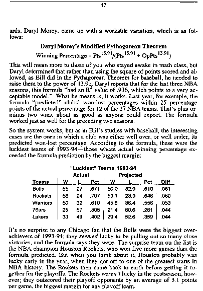
In a previous post, I looked at a 1994 paper by Daryl Morey (current Houston Rockets GM) who investigated how a team's winning percentage was related to the number of points they scored and allowed, deriving the "modified Pythagorean theorem":
expected win percentage =
pts_scored ^ 13.91 / (pts_scored ^ 13.91 + pts_allowed ^ 13.91)
At the end of his paper, Daryl explores teams who had the biggest delta between their actual and predicted wins. In 1993-1994, the Chicago Bulls and Houston Rockets top the list and Daryl refers to them as lucky teams. But why is lucked involved?
The rationale is that if you have two teams A and B with almost identical points scored and points allowed, we would expect them to have very similar win percentages. The only way to create a discrepancy (without changing points scored and points allowed... too much), is by changing the outcome of the very close games. So for all the games team A won by a point, flip the scores so that they lose by 1, and reversely for team B who now wins all the games they previously lost by 1. With this hypothetical construction, we will have two teams still with very similar points scored and allowed but potentially different records. It would make common sense that for very close games the probability of each team winning is around 50%, so winning or losing amounts to "luck", whether a desperation buzzer-beater is made or bounces off the back of the rim. And so it would make sense that teams with high discrepancies between actual and predicted wins were either much better or much worse than 50% in close games. Let's confirm.
Here's the table of teams with discrepancies greater or equal to 6 between their actual and projected records, ranked by year:
So how did these teams fare in close games? I've labelled a team/year as High if they won 6 or more games than expected (8 teams from the previous list), Low if they lost 6 or more games than expected (13 teams from the previous list), and Normal otherwise. I then look for each group their win percentage in closely contested games (final scores within 1, 2 and 3 points).
Final scores within 1 point:
Final scores within 2 points:
Final scores within 3 points:
Our intuition was correct and so were Daryl's closing comments: teams can indeed be qualified as lucky and unlucky, some winning almost 3 out of 4 close match-ups, others losing 2 out of 3 tight games. This intangible "luck" factor is sufficient to explain why certain teams have much better or worse records than their offense/defense would typically lead to. It doesn't take much for to flip the outcome of an entire game.
As a quick aside, much has been said about the San Antonio Spurs this year and their drop from a potential 2nd seed to 6th seed entering the Playoffs. Most articles focused on their loss on the final day of the regular season which led to that seeding free-fall, but was excessive focus placed on that last game? Had they been particularly lucky/unlucky during the season? It turns out their record is a couple games lower than what the modified Pythagorean theorem would have predicted, and that they weren't particularly lucky or unlucky in their close games, winning 2 of 5 games decided by 1 point, and 6 of 13 decided by 3 points or less.
expected win percentage =
pts_scored ^ 13.91 / (pts_scored ^ 13.91 + pts_allowed ^ 13.91)
At the end of his paper, Daryl explores teams who had the biggest delta between their actual and predicted wins. In 1993-1994, the Chicago Bulls and Houston Rockets top the list and Daryl refers to them as lucky teams. But why is lucked involved?
The rationale is that if you have two teams A and B with almost identical points scored and points allowed, we would expect them to have very similar win percentages. The only way to create a discrepancy (without changing points scored and points allowed... too much), is by changing the outcome of the very close games. So for all the games team A won by a point, flip the scores so that they lose by 1, and reversely for team B who now wins all the games they previously lost by 1. With this hypothetical construction, we will have two teams still with very similar points scored and allowed but potentially different records. It would make common sense that for very close games the probability of each team winning is around 50%, so winning or losing amounts to "luck", whether a desperation buzzer-beater is made or bounces off the back of the rim. And so it would make sense that teams with high discrepancies between actual and predicted wins were either much better or much worse than 50% in close games. Let's confirm.
Here's the table of teams with discrepancies greater or equal to 6 between their actual and projected records, ranked by year:
| Team | Year | Scored | Allowed | Wins (proj) | Wins (actual) | Win % |
| NJN | 2000 | 98.0 | 99.0 | 38 | 31 | 37.8 |
| DEN | 2001 | 96.6 | 99.0 | 34 | 40 | 48.8 |
| NJN | 2003 | 95.4 | 90.1 | 56 | 49 | 59.8 |
| CHA | 2005 | 94.3 | 100.2 | 24 | 18 | 22.0 |
| NJN | 2005 | 91.4 | 92.9 | 36 | 42 | 51.2 |
| IND | 2006 | 93.9 | 92.0 | 47 | 41 | 50.0 |
| TOR | 2006 | 101.1 | 104.0 | 33 | 27 | 32.9 |
| UTA | 2006 | 92.4 | 95.0 | 33 | 41 | 50.0 |
| BOS | 2007 | 95.8 | 99.2 | 31 | 24 | 29.3 |
| CHI | 2007 | 98.8 | 93.8 | 55 | 49 | 59.8 |
| DAL | 2007 | 100.0 | 92.8 | 61 | 67 | 81.7 |
| MIA | 2007 | 94.6 | 95.5 | 38 | 44 | 53.7 |
| SAS | 2007 | 98.5 | 90.1 | 64 | 58 | 70.7 |
| NJN | 2008 | 95.8 | 100.9 | 27 | 34 | 41.5 |
| TOR | 2008 | 100.2 | 97.3 | 49 | 41 | 50.0 |
| DAL | 2010 | 102.0 | 99.3 | 49 | 55 | 67.1 |
| GSW | 2010 | 108.8 | 112.4 | 32 | 26 | 31.7 |
| MIN | 2011 | 101.1 | 107.7 | 24 | 17 | 20.7 |
| PHI | 2012 | 93.6 | 89.4 | 43 | 35 | 53.0 |
| BRK | 2014 | 98.5 | 99.5 | 38 | 44 | 53.7 |
| MIN | 2014 | 106.9 | 104.3 | 48 | 40 | 48.8 |
So how did these teams fare in close games? I've labelled a team/year as High if they won 6 or more games than expected (8 teams from the previous list), Low if they lost 6 or more games than expected (13 teams from the previous list), and Normal otherwise. I then look for each group their win percentage in closely contested games (final scores within 1, 2 and 3 points).
Final scores within 1 point:
| Type | # Wins | # Games | Win % |
| Normal | 721 | 1439 | 50.1 |
| Low | 8 | 21 | 38.1 |
| High | 2 | 2 | 100.0 |
Final scores within 2 points:
| Type | # Wins | # Games | Win % |
| Normal | 1760 | 3515 | 50.1 |
| Low | 20 | 52 | 38.5 |
| High | 10 | 13 | 76.9 |
Final scores within 3 points:
| Type | # Wins | # Games | Win % |
| Normal | 2820 | 5617 | 50.2 |
| Low | 24 | 80 | 30.0 |
| High | 14 | 19 | 73.7 |
Our intuition was correct and so were Daryl's closing comments: teams can indeed be qualified as lucky and unlucky, some winning almost 3 out of 4 close match-ups, others losing 2 out of 3 tight games. This intangible "luck" factor is sufficient to explain why certain teams have much better or worse records than their offense/defense would typically lead to. It doesn't take much for to flip the outcome of an entire game.
As a quick aside, much has been said about the San Antonio Spurs this year and their drop from a potential 2nd seed to 6th seed entering the Playoffs. Most articles focused on their loss on the final day of the regular season which led to that seeding free-fall, but was excessive focus placed on that last game? Had they been particularly lucky/unlucky during the season? It turns out their record is a couple games lower than what the modified Pythagorean theorem would have predicted, and that they weren't particularly lucky or unlucky in their close games, winning 2 of 5 games decided by 1 point, and 6 of 13 decided by 3 points or less.
Saturday, February 28, 2015
Morey's Law: How do points scored and points allowed tie to win percentage?
It all started in baseball, when Bill James found a very elegant formula linking a baseball team's winning percentage to the number of runs it scored and allowed:
expected win percentage =
runs_scored ^ 2 / (runs_scored ^ 2 + runs_allowed ^ 2)
Because the variables are raised to the second power, the formula became knows as the "Pythagorean expectation formula".
In 1994, Daryl Morey, one of the biggest proponent of analytics in basketball and now GM for the Houston Rockets, adapted the formula for basketball teams. The overall structure remains the same, but the power of 2 was replaced by 13.91. Here's an extract from Daryl's formula in STATS Basketball Scoreboard:
Essentially the same formula as for baseball but with 13.91 as the power:
expected win percentage =
pts_scored ^ 13.91 / (pts_scored ^ 13.91 + pts_allowed ^ 13.91)
In this post, I wanted to further explore this formula and answer questions such as: how accurate is it? it was based on data up until 1993-1994, is it still accurate with today's data? are there other more accurate formulas out there?
To start off, I extracted all relevant statistics by team and by year for the past 15 complete seasons, going from 1999-2000 to 2013-2014.
Let's start by looking at how accurate Daryl's formula is when looking through these last seasons:
Well, formula still applies quite well to say the least! Of course, the exact coefficient might be slightly off so I used the more recent data, and fit the same model. The fitted value for the exponent turned out to be 13.86. Despite all the rule changes over the bast twenty plus years (three free throws on three-point fouls, hand-checking, clear path...) and the fact that the early nineties are regarded as a completely different era of basketball as now (somewhat linked to the rule changes), the value is almost identical, less than a 0.4% difference!
But back to the formula. It seems to perform remarkably well and fitting the data, but can we do better? There is room for additional flexibility: in Morey's formula, all three terms are raised to the same power. What if points scored and points allowed were allowed to be raised to different values?
expected win percentage =
pts_scored ^ a / (pts_scored ^ a + pts_allowed ^ b)
Or if all three terms could have different powers?
expected win percentage =
pts_scored ^ a / (pts_scored ^ c + pts_allowed ^ b)
When fitting those new more flexible models, it turns out that the fitted coefficients remain very close to 14. Naturally with additional we observe a decrease in residual sum of squares, but nothing extravagant either. We'll revisit this point later in the post.
But let's step back for a minute, what exactly does the exponent value correspond to? For values scored and allowed points ranging from 90 to 110, I generated three charts displaying expected win percentage for the respective exponent values of 2, 14 and 50.
We notice that the value controls how slowly/quickly the surface goes to 0 and 1 as the difference between points scored and allowed increases. When points scored is 100 and points allowed is 95, win percentages are 52% (exp of 2), 67% (exp of 14) and 93% (exp of 50).
But something else stands out in all graphs: they appear invariant in one direction, the first diagonal (going through points (90, 90) and (110, 110)). In other terms, a team allowing 90 points and scoring 93 has an expected winning percentage only very slightly off from another team scoring 110 and allowing 107. What truly matters is the delta between points allowed and scored, not the absolute value of these two numbers.
Let's do some very simple exploratory data analysis looking at actual win percentages against points scored and allowed:
As one would have expected there is definitely some correlation there - especially regarding points allowed (which could be an additional argument for promoting a strong defense over a strong offense, but that is for another time).
But things get really interesting when we look at the difference between points scored and allowed:
You don't often come across a correlation of 0.97 just plotting two randoms against each other in your data set! It looks like someone created a rectangular stencil in cardboard, placed it over tan empty plot, and asked their 3-year old kid to go polk-a-dot-crazy within the rectangular region. Can this strong relationship be leveraged for an alternative formula to Morey's?
A simple linear model begs to be fit, but would it also make sense to add a quadratic or cubic term? Quadratic (or any even number fo that matter) does not seem reasonable: a delta of 5 or -5 suggest VERY different types of performances, so only odd-numbered powers should be considered. Here's the plot with the fits from a single term and with an additional cubic term:
We've now come to the point where we have five models (the three "pythagorean" with various degrees of flexibility which I'll refer to as the single/double/triple power models based on how many coefficients are fit) and two linear models (with and without the cubic term). Can one be established as being significantly superior to the others? Will Morey's formula hold?
Of course the easiest way to compare would be looking at the fits and comparing residual sum of squares, but this will always lean towards the more complex models and yield to the overfitting problems we constantly hear about. So how do we go about it? Simply the way overfitting is dealt with in the abundant litterature: cross-validation. The data is randomly split in to training and testing datasets, the model is constructed based on the training data, but evaluated on the test data never seen before.
And the results are in!
Based on my random splits, it seems's that while all models perform very similarly, Morey's formula (simple power) has a slight advantage. It didn't achieve the minimal RSS, did yield the maximum, but median RSS was lower than all other models, though not significantly.
So after all this work, we weren't able to come up with a better way to reliably and robustly compute expected win percentages than a formula over 20 years old!
In a next post we'll dig a little deeper into the data and try to understand the largest discrepancies. In his original paper, what did Daryl Morey mean when referring to the Chicago Bulls as a lucky team in 1993-1994?
Monday, February 23, 2015
Shaqtin-a-bias?
All NBA fans know about Shaqtin-a-fool.
Once a week, Shaquille O'Neal hosts this small segment on the NBA on TNT show. Five humorous video clips are shown, with players definitely not at their best. Erratic passes, obvious travels, missed wide-open dunks and layups, lost shoes...
The segment is also available on nba.com, and fans can vote for the best Shaqtin-a-fool moment.
For volume 4 episode 11 (they're referenced just like a TV series, with season and episode), and similarly to over 50% of the voters, I had voted for the last video clip shown which was that week's clear winner. A weird sensation I had been carrying over from week to week suddenly materialized: it seemed to me that the last video clip was winning a disproportionate number of times.
Two explanations came to mind: the video clips were not shown randomly in Shaq's segment, but sorted according to users' preferences. Or the human mind was biased with its short term memory, not exactly remembering the first clips, and finding the last disproportionately funnier.
It was all the more obvious for this episode 11, where the poll results were in the exact reverse order they were shown in:
But before investigating the human brain and mind too deeply, I first had to see if my brain wasn't the one tricking me, and sought statistical confirmation that there was indeed a bias favoring the last video shown.
First things first, data was required. Unable to automatically run a script to pull the survey results from polldaddy.com, I manually went through the last 28 episodes (including some special episodes for the All Star Game, the Playoffs and past eras), noting for each video the order it was shown ("Input Order"), and the position it was in the survey results ("Output Ranking").
A quick first visual exploration of the data, linking Input Order to Output Ranking:
I added some jitter to avoid all the lines overlaying each other and hiding the number of observations. It did seem that the majority of the lines were in the steepest diagonal, indicating that the most common "transition" was from videos being shown in 5th position coming out first in the survey results. At least I wasn't imagining the whole thing!
Because the diagonal has longer length than horizontal lines, there could still be an optical illusion suggesting that indeed there are more lines when we are actually seeing more color from longer lines, not more lines. So I re-generated the same graph but reversing the order of the inputs, so that the last video shown is not labelled 1, and the first video shown is 5.
No visual trick here, definitely looks like the last video shown is the most likely to win the poll (horizontal lines going from 1 to 1).
Now for the statistical confirmation. The most suited test here is a chi-square, comparing observed counts with expected counts under the null hypothesis that video order doesn't matter and all videos are equally likely to end up in any position.
The first test I ran looked at the full data and all the Input Order - Output Ranking counts:
| Output: 1 | Output: 2 | Output: 3 | Output: 4 | Output: 5 | |
|---|---|---|---|---|---|
| Input: 1 | 3 | 3 | 13 | 6 | 3 |
| Input: 2 | 1 | 2 | 3 | 10 | 12 |
| Input: 3 | 4 | 5 | 6 | 9 | 4 |
| Input: 4 | 3 | 8 | 5 | 3 | 9 |
| Input: 5 | 17 | 10 | 1 | 0 | 0 |
The chi-square strongly rejected the null hypothesis: input order and output ranking were strongly linked.
The second test focused uniquely on the winner of the poll. In which position was the winner shown?
The table below summarizes the data:
| Input: 1 | Input: 2 | Input: 3 | Input: 4 | Input: 5 | |
|---|---|---|---|---|---|
| Count | 3 | 1 | 4 | 3 | 17 |
That's right, in 60% of cases the survey winner was shown in last position! It's clear from the data that not all positions are created equally and a second chi-square confirmed this.
So back to Shaq. Now that we've confirmed that there is a strong bias, can we try explaining the phenomenon?
My first idea (perhaps having spent too much time doing analyses for marketing teams!) was that the videos were not randomly shown but already sorted according to expected viewers' preference. It's a possibility, but a rather weak one. What would be the rationale? To get people hooked on the show as the clips get funnier and funnier? Sure, but recall that the whole Shaqtin-a-fool lasts 2-3 minutes tops, I'm not not sure if users really need to get hooked. Plus, until they see the last videos, the audience has no way of determining whether the best videos have already been shown.
So, I'm actually leaning towards an unconscious bias. I think the same phenomenon occurs if you were asked to rank your best vacations. There might be some clear "great vacations" (honeymoon), and "bad vacations" (lost wallet, passport, got sick), but I believe that with equally enjoyable vacations, the brain might be tempted to rank the latest one higher. A modality effect has been documented usually to describe the improved recall of the last elements of a list, typically when these are presented visually or auditory. I'd be willing to bet something similar is at play here.
However, even if the survey results are much more predictable now, I'm still going to continue watching Shaqtin-a-fool religiously. For pleasure... and more data.
Thursday, February 12, 2015
Are freethrows game-changers?
"And another missed free throw!"
"That's the story of the game right there, they just can't get those easy points from the charity line."
I've heard very similar discussions to this one over and over throughout the years from basketball commentators. Although not truly meaning it (at least I think), the commentator was heavily implying that the outcome of the game would be extremely different if a given team had made all, or significantly more, of its free throws.
Don't expect a sophisticated analysis here, I was just curious to explore the correlation between difference in final score and number of missed free throws.
So I wanted to investigate the two following questions:
- If the losing team had made all its attempted free throws, would the outcome of the game have been different?
- If the losing team AND the winning team had made all of their attempted free throws, would the outcome of the game have been different?
To answer those questions, I pulled all boxscores for regular season games from the 1999-2000 season to the last complete one, 2013-2014 and for each game tracked the final score difference, as well as the number of missed free throws for both the winning and losing teams.
Here's a first quick visual of the relationship between the number of missed free throws for each team (losing team on the lefthand graph, winning team on the righthand graph) and the final score difference:
Rather surprisingly, there does not appear to be any link between the number of missed free throws and the outcome of the came in terms of close game or huge blowout. It would have seemed natural to assume that the more free throws the loser team has, the more likely they are of getting blown out, and the opposite argument for the winning team.
How have these numbers evolved over time? Here's the evolution of the average score difference and missed free throws for those 15 seasons:
Not completely obvious trends emerge from the graph, but if anything can somewhat notice that:
- the lines for the winning and losing team are extremely similar
- average score difference has stayed flat or perhaps very slightly increased
- number of missed free throws has decreased (could be due to better shooting and/or less free throws attempted, and it's actually a little of both)
Now of course this analysis has been as naive as they come. You can't just expect free throws to go from missed to made and expect the entire game to follow its original course. Players might get confidence as they rack up easy points, and coaches might change strategies if what would have been a big lead is only a 2/3 point lead. The point of the exercise here was to compare the range of final point differential to number of missed free throws, and it would seem that free throws only account for about half the final gap. This could be a reason why teams, coaches, players don't put in crazy efforts to have all players shoot 99%. Their time is probably better spent on other types of training.
That being said, I just had to mention the other day's game which saw both teams shoot a combined 37% (16 for 43, 8 for 25 for the Clippers, 8 for 18 for the Nets) from the free throw line. To put things in perspective, Shaquille O'Neal who was criticized his entire career for those shots was 53% over his career (despite finding elaborate strategies to boost the percentage). Consider the Clippers lost by a mere two points 100-102, I'm sure they must be kicking themselves for their performance at the line.
Also worth noting, this game from 1999 between Portland and the Lakers. Portland won quite big - by 15 - but missed only one free throw. The Lakers missed 17! Had both teams been perfect, the Lakers could have actually won a game they lost by 15. This was the biggest outcome reversal I observed in the data if both teams had been perfect.
Thursday, February 5, 2015
Are we seeing All-Stars at the All-Star?
The starters for the Western and Eastern teams of the upcoming NBA All-Star game were just announced Jan 22nd. The selection was uniquely based on fan votes.
In the West we have the vote-leading player Steph Curry, along with Marc Gasol, Blake Griffin, Kobe Bryant and Anthony Davis. Their Eastern counterparts will be Pau Gasol (not sure how often two brothers have faced each other in an All Star Game...), LeBron James, Kyle Lowry, John Wall and Carmelo Anthony.
The selection did raise quite a few eyebrows to say the least. Kobe? Sure he's an NBA legend, future hall-of-famer and all, but look at the Lakers record this season, look at his abysmal shooting percentage of 37.3%. Carmelo is also somewhat of a surprise given how the Knicks are performing this year. Sure the All Star is not about the team but the player, but his stats aren't eye-popping either. And then consider all the ones who didn't get in, James Harden, Klay Thompson, the entire Atlanta Hawk roster... Even if not for those reasons but purely on the voting volume, Mark Cuban declared the voting system broken.
fivethirtyeight.com had a very interesting post on the topic, attempting to correlate players' performance with the number of votes received. Performance was measured in terms of Win Above Replacement (WAR), the number of team wins attributable to that player (computed as the difference between the number of wins the team got with that player in the game, versus a hypothetical world where the player is replaced by an average player). It does seem that the above a certain threshold, high-impact players get the votes they deserve, but under that threshold it's all more or less random.
Now I think the real question is: what do we want in an All Star game? Players naturally view it as an honor, a testimony of a great year they're having. But are fans voting for players deserving recognition? Or do they want pure 100% showtime? Imagine a natural born dunker, explosive, athletic and artistic at the rim. Even if that player had below average EFG%, below average WAR, RPM, RAPM or any of the other advanced metrics to measure player performance, wouldn't fans still want to see him in the All Star game?
So while I'm not saying it's fair to the players, I can understand why a Kobe would get voted in, and why a Paul Millsap or Kyle Korver wouldn't. If we really want to understand how fans vote, it would be interesting to see if we could find a metric that better correlates with player votes than WAR. Or perhaps first start including WAR for past seasons as well? I'm sure that if we did that we would have a better understanding as to why Kobe got voted. But how about a combination of team wins + number of dunks in the season? Or number of fast break points?
The debate does seem old and familiar, perhaps because it's so closely related to the one we have every single year about who should be MVP and how MVP is defined? The player with the stellar stats? The player who was most impactful on his team's success?
Subscribe to:
Posts (Atom)